E-commerce UX · Temu
The clutter wasn't an accident. It just wasn't designed for the shopper.
A compact HCI redesign to reduce friction and dark-pattern confusion in a budget-commerce app. We ran a heuristic review, talked to classmates about their Temu habits, mapped key tasks from search to checkout, and prototyped a calmer, more trustworthy version in Figma.
- Role
- UX Research & Design, course project
- Timeline
- 3 weeks
- Contribution
- Research, heuristic evaluation, redesign
Where it started
Do shoppers want a fireworks show of coupons, or straight answers?
My journey with UX started off with this project. Temu, and its peers, lean on busy layouts and last-minute fee reveals. Our brief: keep the deal-hunt energy, but replace noise with clarity, trust, and momentum to checkout. As a team, we ran a brief heuristic review, spoke with classmates about their Temu habits, mapped key tasks (search → product → cart → checkout → order status/returns), and prototyped improvements in Figma. I worked on this with Sanjith Kumar, Kamalesh Balan, and Marian Gasinu.
- Make it obvious: what I pay and how I return, up front.
- Reduce cognitive load on dense product pages.
- Shorten cart → checkout, with fewer decision dead ends.
- Add gentle trust cues (policies, badges, delivery windows) where they matter.
Concept in one breath
An opt-in, clarity-first layer that keeps the thrill of bargains while stripping noise: we surface the true total cost (price + fees + shipping) and return eligibility up front, calm product pages with a tighter hierarchy and consistent microcopy, and streamline cart → checkout with one clear primary action per step.
Research
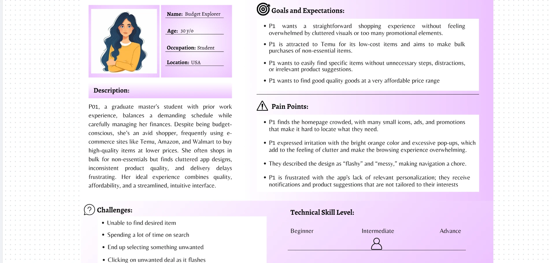
Each of us individually interviewed two classmates and built a persona and user flow from those conversations. Here's the persona and flow I created.
"The homepage is flashy with too many options and tiny icons. Finding what I want feels like a task."
"It keeps flashing deals and notifications; recommendations don't match what I need."
"Bright colors are fine, but the screen is crowded. Filters don't always give accurate results."
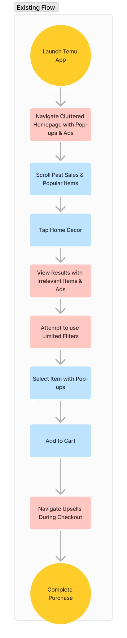
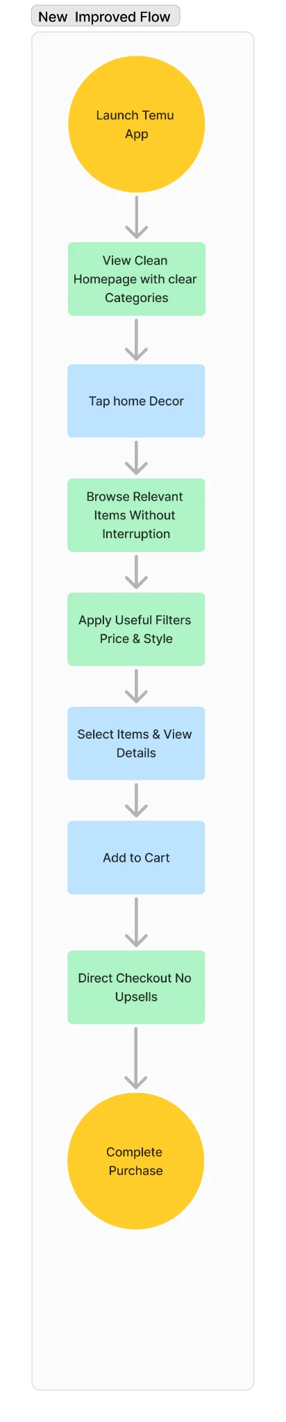
Key features of the user flow visualization:
- Yellow nodes mark starting and ending points, green nodes show completion points.
- Red-highlighted steps show pain points in the existing flow, green-highlighted steps show improvements in the new flow.
- A parallel layout enables easy comparison between the two flows, reducing the number of steps from 9 to 8, eliminating interruptions and distractions, and providing a more direct path to purchase.
Heuristic evaluation
Assessed against Jakob Nielsen's 10 usability heuristics
Click a card below to see what we found.
-
Aesthetic and Minimalist Design
Pop-ups frequently disrupt the user flow by appearing during essential tasks, forcing users to dismiss them before proceeding. This increases cognitive load and distracts users from their primary goals, a pattern researchers describe as a "dark pattern" in UX design.
-
Consistency and Standards
Inconsistent icon styles and color schemes create a lack of visual continuity. Labels like "Best Sellers" and "5-Star Rated" are used interchangeably, leaving users unsure whether they reflect popularity based on sales, ratings, or both.
-
Visibility of System Status
The cart and checkout pages lack clear feedback when users add items or proceed through checkout, leaving them uncertain if their actions succeeded. This can lead to duplicate actions or abandonment.
-
Error Prevention
Checkout form fields lack guidance, leading to common errors like missing information. Without real-time validation, users discover mistakes only after the fact, disrupting the flow and causing frustration.
-
User Control and Freedom
Users can only access additional features or view more content after signing in, creating a sense of restriction. This can lead to frustration and abandonment if people feel pressured to create an account prematurely.
Key findings → design moves
Designed- Clarity over clutter. Homepage and product pages were noisy with promos and competing CTAs, we decluttered, elevated Search + Categories, and set one clear primary action per screen.
- Confident browsing & account. Finding, refining, and post-purchase tasks were fragmented, we added strong filters and breadcrumbs on browse, and a clean profile hub for orders, saved items, addresses, returns, and notifications.
- Info first, not last. Shipping window, fees, and return policy were revealed late, we surfaced ETA and returns above the fold on the product page, repeated near the CTA, and kept a sticky price breakdown visible end-to-end.
- Predictable checkout. The flow felt uncertain and "surprisey" on totals, we moved to 3 steps (Address → Payment → Review) with progress, inline validation, and a persistent order summary (items, shipping, tax, promo).
Prototyped in Figma
The redesign
Simplified navigation with a prominent search bar and grouped categories, intrusive pop-ups replaced with subtle banners, and a clearer visual hierarchy that prioritizes essential actions.
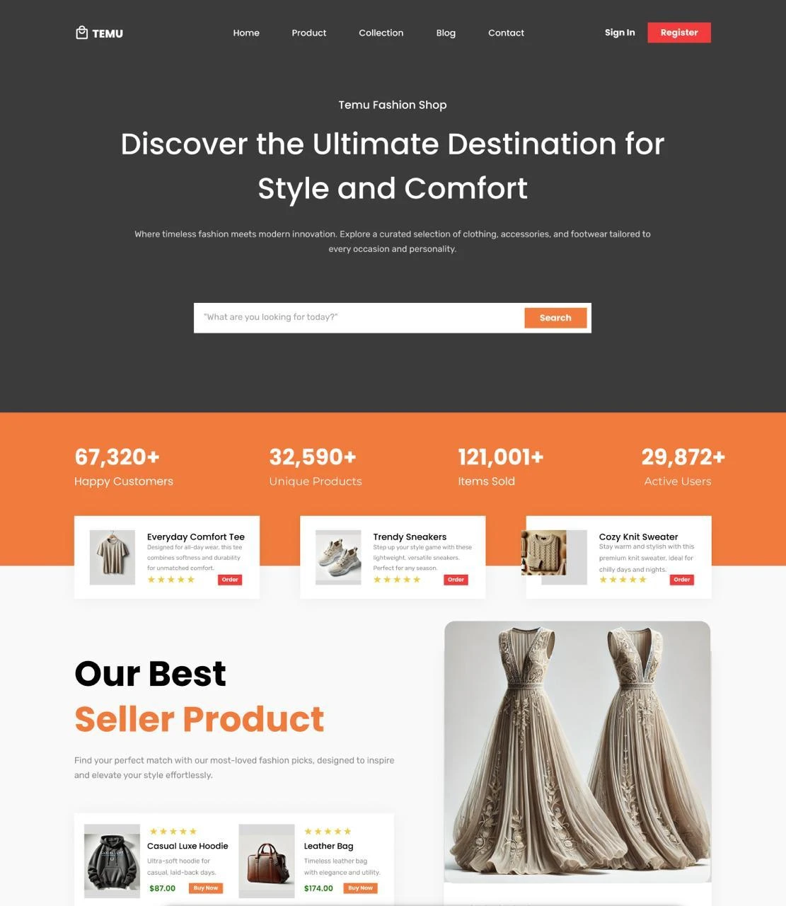
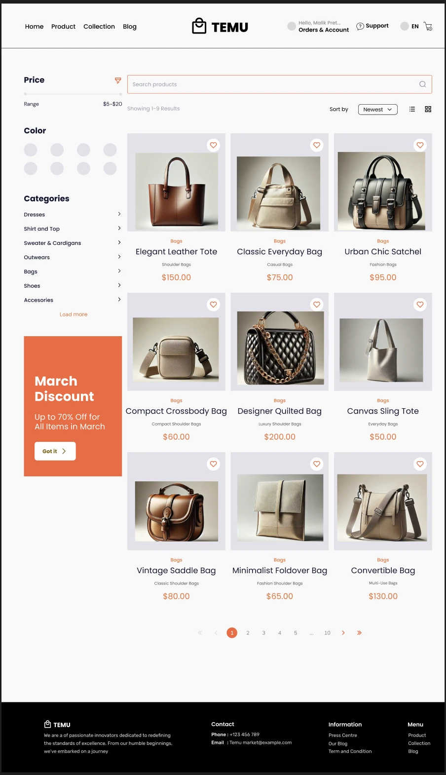
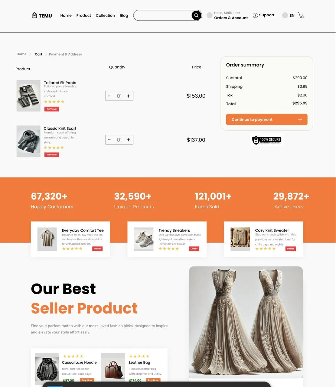
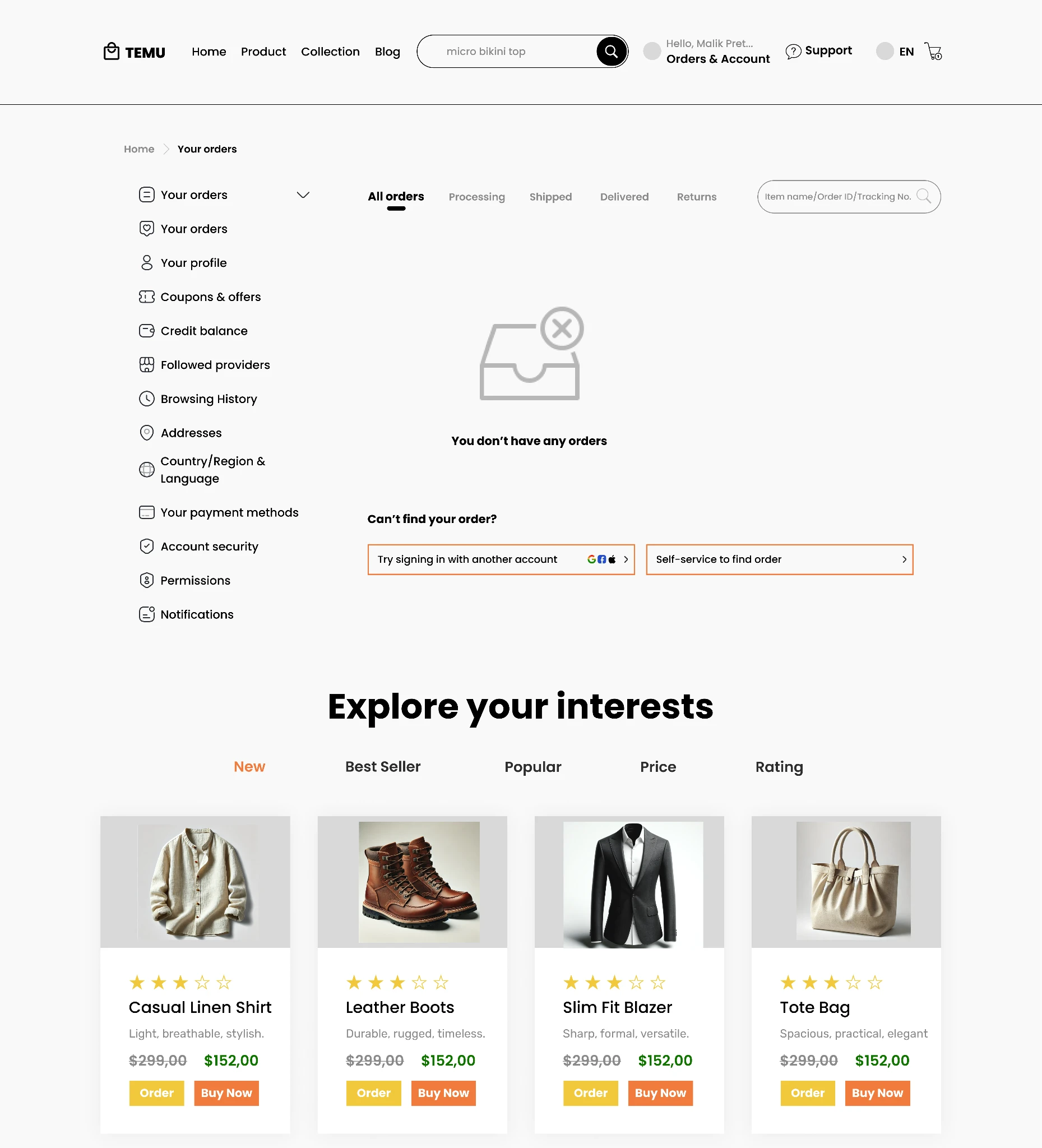
A sticky search bar and simple sort dropdown ("Newest," "Price: Low to High," "Price: High to Low") stay visible while browsing. A collapsible sidebar keeps price range, category, color, and shipping filters out of the way until needed, with real-time updates so results refresh without breaking a user's flow.
What we expect to change
- Speed up discovery: focused filters and cleaner results help users find relevant products faster with fewer backtracks.
- Clarify costs early: up-front shipping, fees, and returns prevent last-minute surprises and build trust.
- Lower cognitive load: a calmer layout reduces visual noise and decision fatigue for new and returning users.
- Make checkout predictable: a 3-step flow with a sticky summary reduces confusion and lowers abandonment.
What I learned
Tested- Transparency reduces uncertainty. Putting shipping, fees, and returns up front lowered ambiguity and mental effort. When costs are predictable, users conserve working memory for the actual choice.
- One clear next step beats choice overload. A single primary CTA per screen cut indecision and mis-taps. Fewer, better cues improved information scent and sped progress.
- Progress and persistence drive commitment. A 3-step indicator and sticky order summary made value and sunk effort salient. Seeing "where I am" and a stable total reduced abandonment risk.
- Run behavioral A/Bs on info-first costs, single vs. multi-CTA, and progress variants, tracking trust, first-click accuracy, time-to-next, completion, and drop-off.
- Use psychology-informed microcopy, risk-reduction ("Free 30-day returns"), implementation intentions ("Start a return in 2 taps"), and light social proof, while avoiding dark patterns.
- Reinforce motivation with gentle goal cues ("Step 2 of 3") and affirmations ("Total is final, no extra fees") to sustain momentum without pressure.
- Validate changes with moderated usability testing (5-7 participants, timed and think-aloud), and ensure WCAG-level contrast, focus order, and inclusive error messaging for non-native speakers.