Interaction Design · Olympus: The Zoo
Where Greek legends meet modern ticketing and way-finding.
Olympus Mythical Zoo is a fully clickable website prototype that lets visitors plan a day among dragons, gorgons, and sky beasts. The experience blends deep world-building, zones like Dragon's Lair, Medusa's Garden, Sacred Grove, and Celestial Peaks, with practical flows for tickets, interactive maps, add-on experiences, and a mythical gift shop.
- Role
- UX/UI & interaction designer, team project
- Timeline
- 3 weeks
- Contribution
- Wireframes, hi-fi prototyping, usability testing
Where it started
How do you build a heavily themed, story-rich website without losing basic clarity?
We needed people to still know where to start, what to visit, and how much the whole trip costs. Olympus had to feel mysterious and magical, and still work as a straightforward information and ticketing system for families, students, and mythology fans.
- Support the full visitor journey online: ticketing, exhibits, map, and gift shop in one cohesive flow.
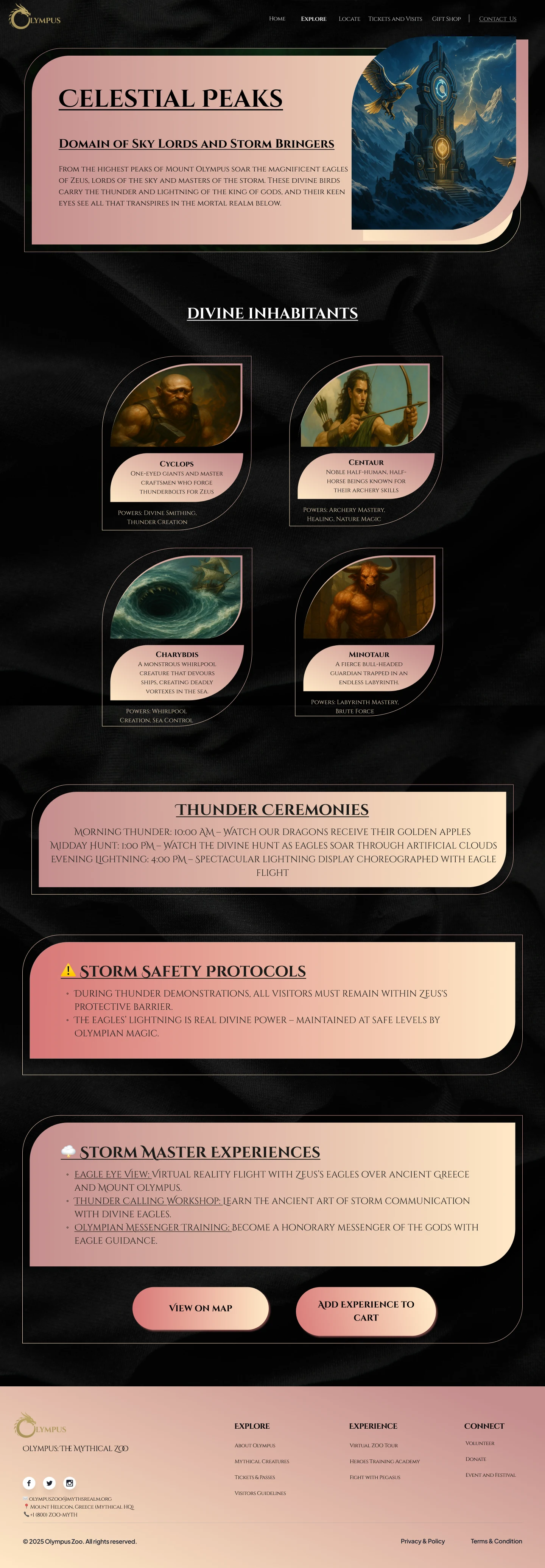
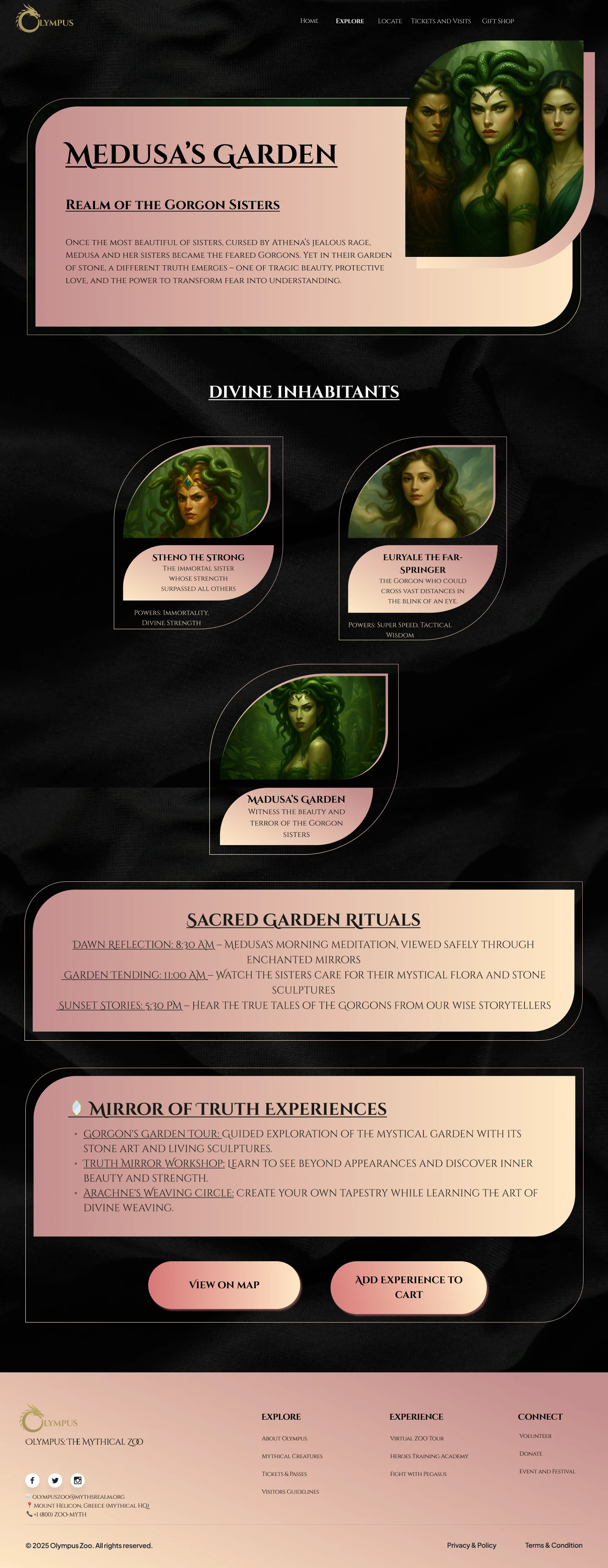
- Use world-building to drive interaction, organizing content into clear mythical zones (Dragon's Lair, Sacred Grove, Celestial Peaks, Medusa's Garden).
- Validate flows with non-UX users and refine the design based on what confused or delighted them.
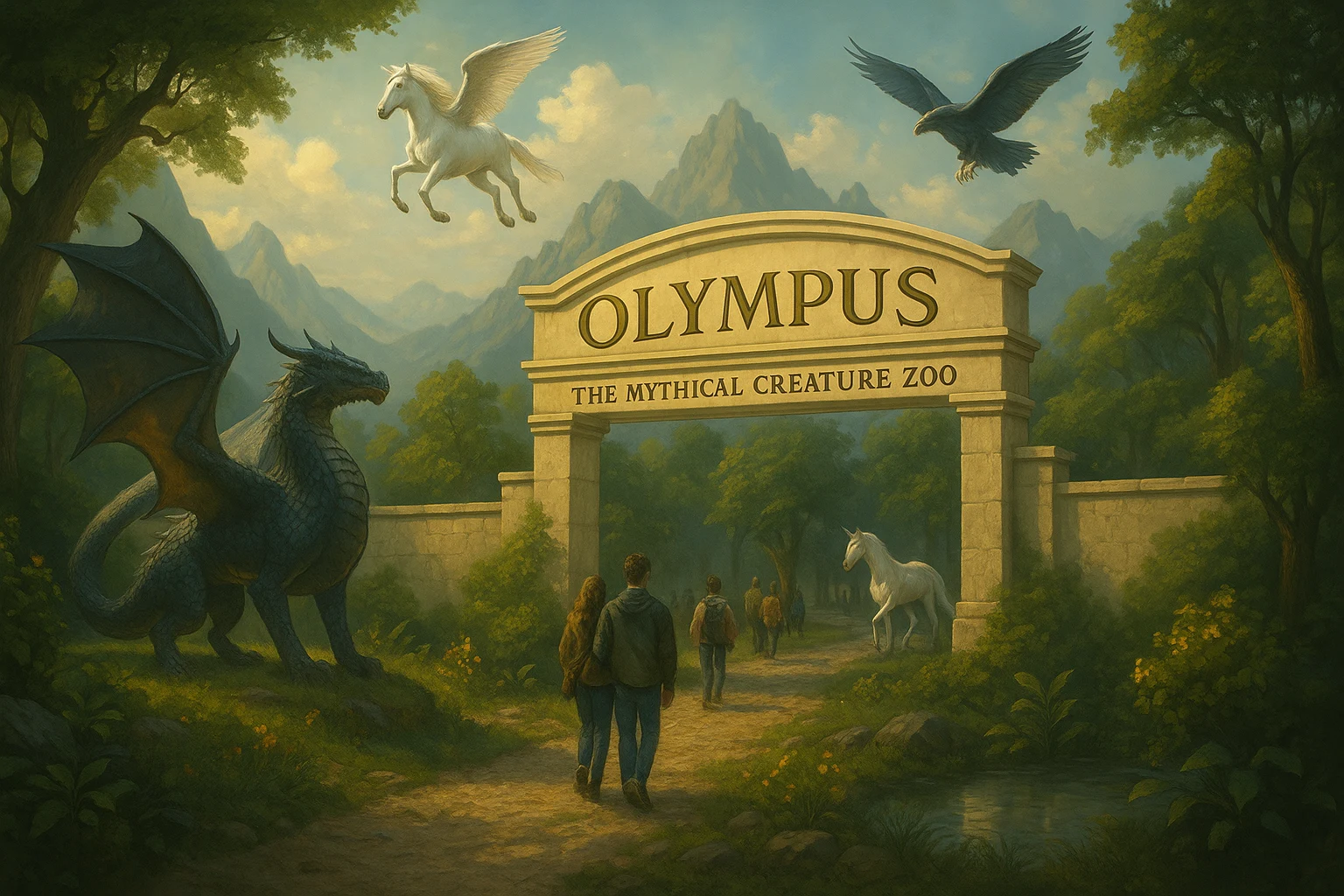
Concept in one breath
Olympus Mythical Zoo is a myth-themed visitor portal that lets people plan, book, and explore an entire fantasy zoo, passes, add-on experiences, maps, and souvenirs, through a single, story-driven website.
Research & early testing, phase 1
Low-fidelity wireframes + concept feedback
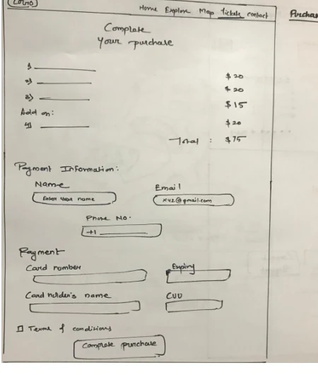
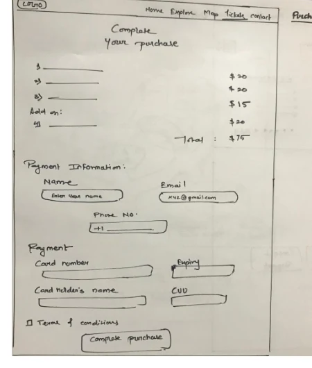
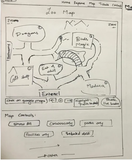
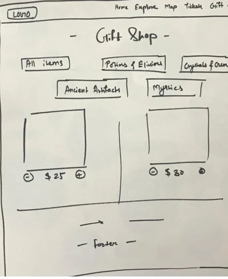
We began with hand-drawn wireframes for home, explore, tickets, purchase, map, and gift shop screens.
- Participants: 3 grad students (2 male, 1 female) with no UX background.
- Method: 20-30 minute in-person walkthroughs of each screen; we explained the concept and asked them to "think aloud" as first-time visitors.
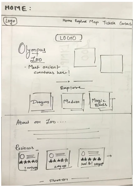
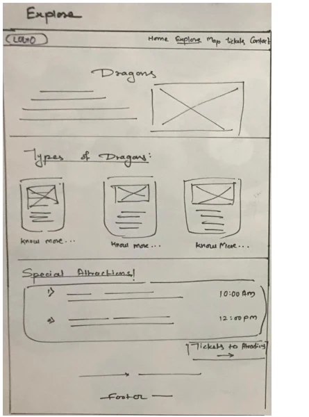
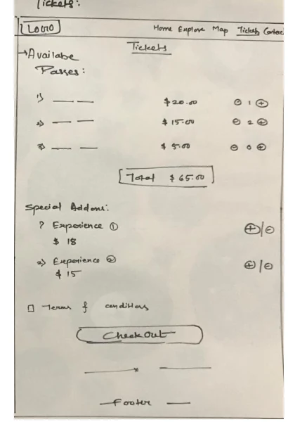
Key insights from wireframe testing
Observed- Checkout needed a date selector. People wanted to pick when they were visiting, not just the number of passes.
- Explore page hierarchy. Users wanted attraction tickets to be easier to click and add, placed more centrally.
- "Know more" overload. Showing full creature backstories up front reduced curiosity, people asked us to "keep some mystery."
- Branding clarity. Two logos on the home page felt confusing.
- Gift shop visibility. A clearer gift shop entry would encourage browsing and extra revenue.
These comments directly shaped the layout and information density in the final high-fi prototype.
Moodboard
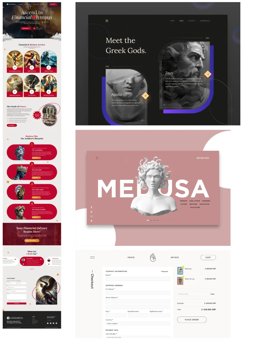
From sketches to screens: we pulled reference sites with dark, mythic aesthetics, dramatic hero art, and confident typography before moving into high-fidelity design.
Prototyping
A cohesive visual system, built for immersion
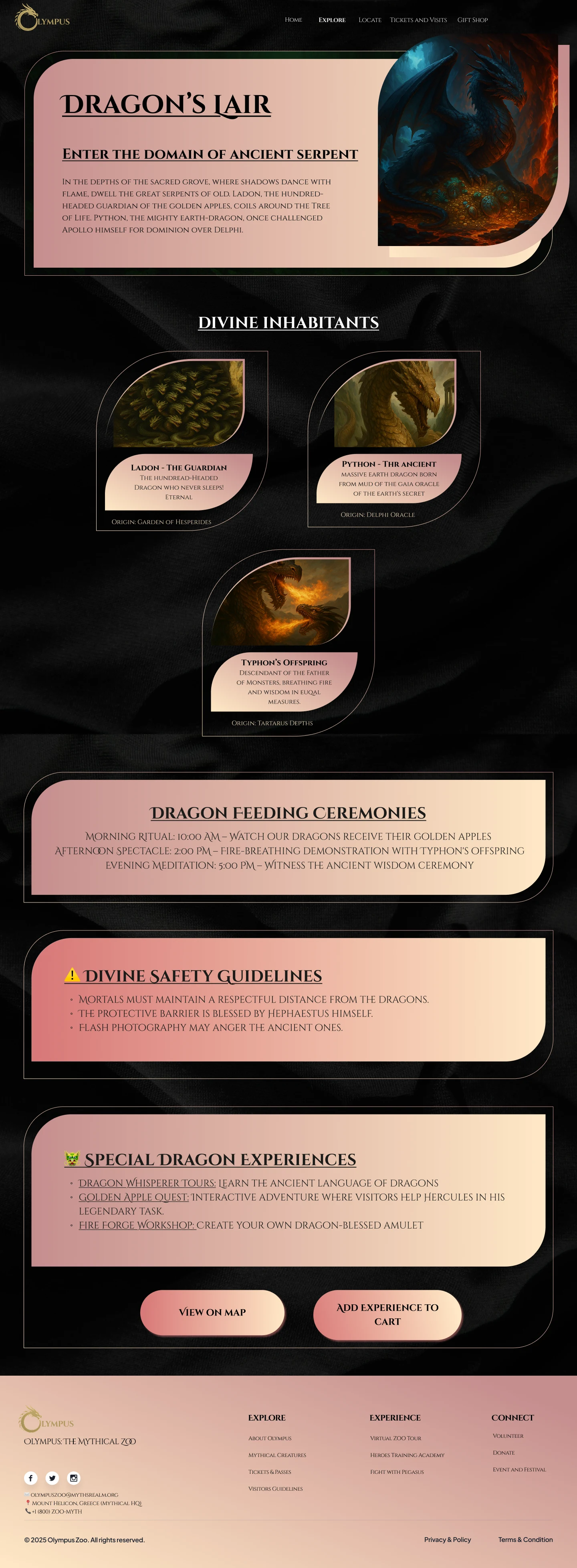
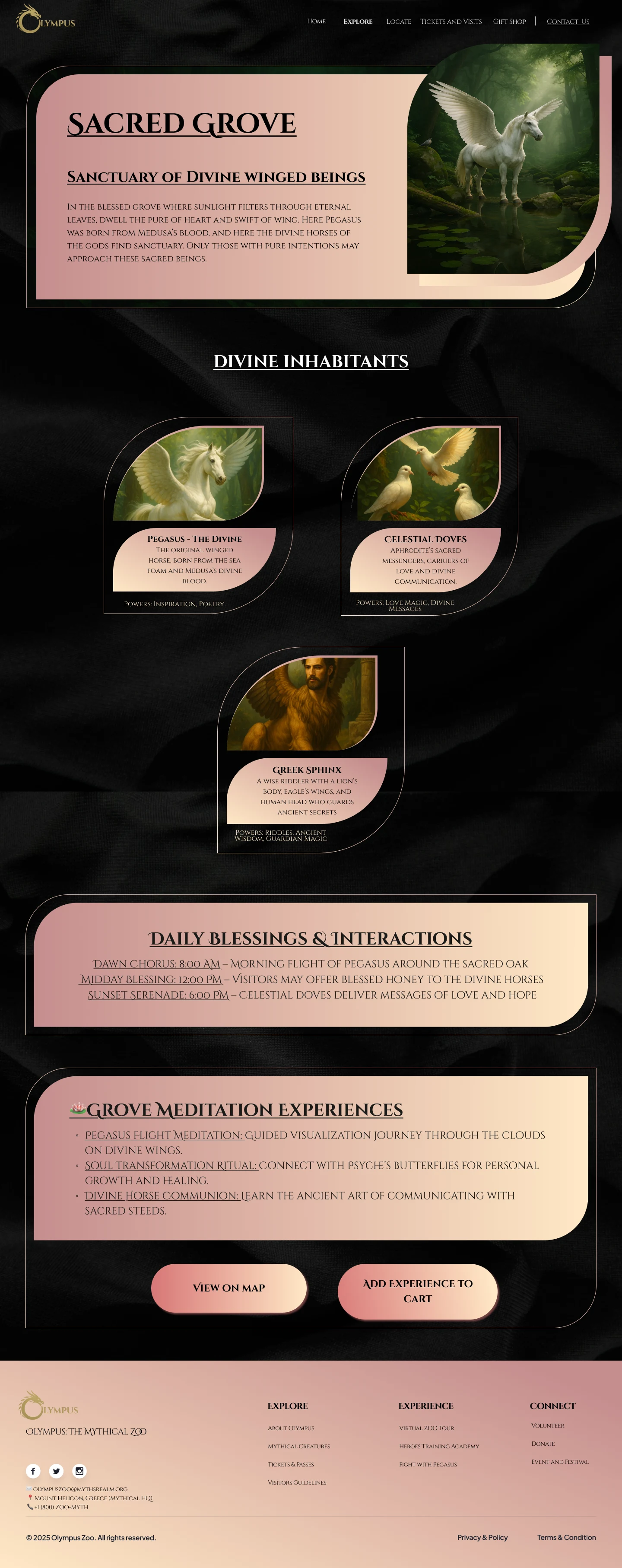
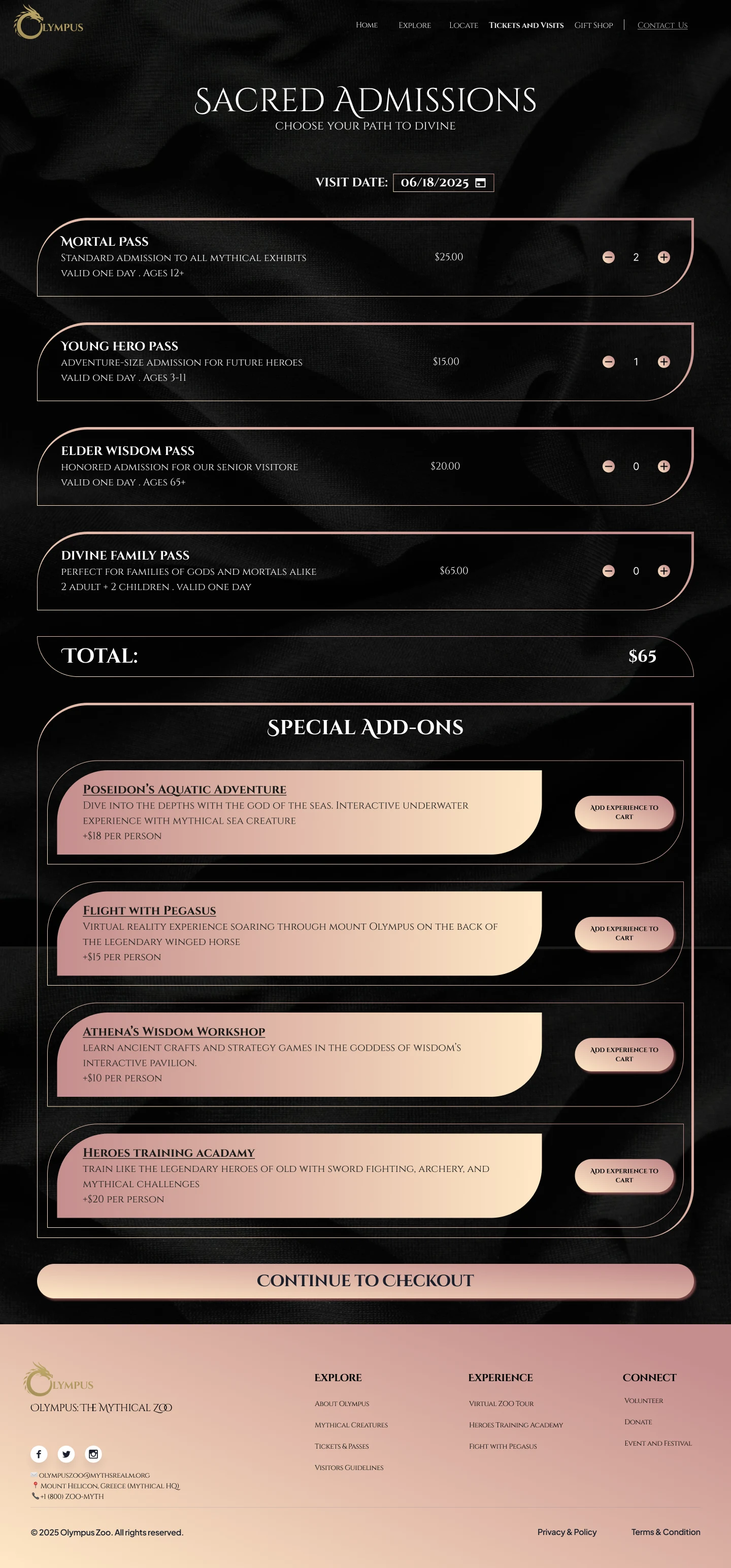
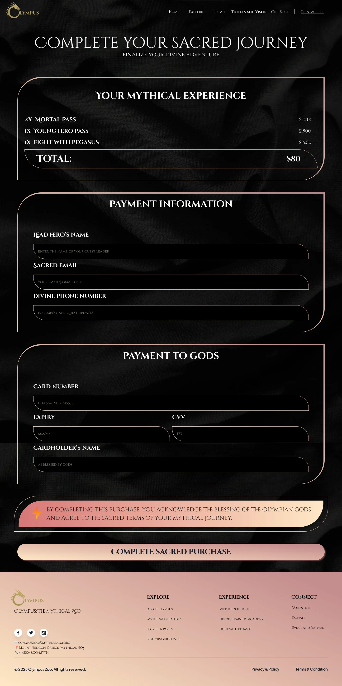
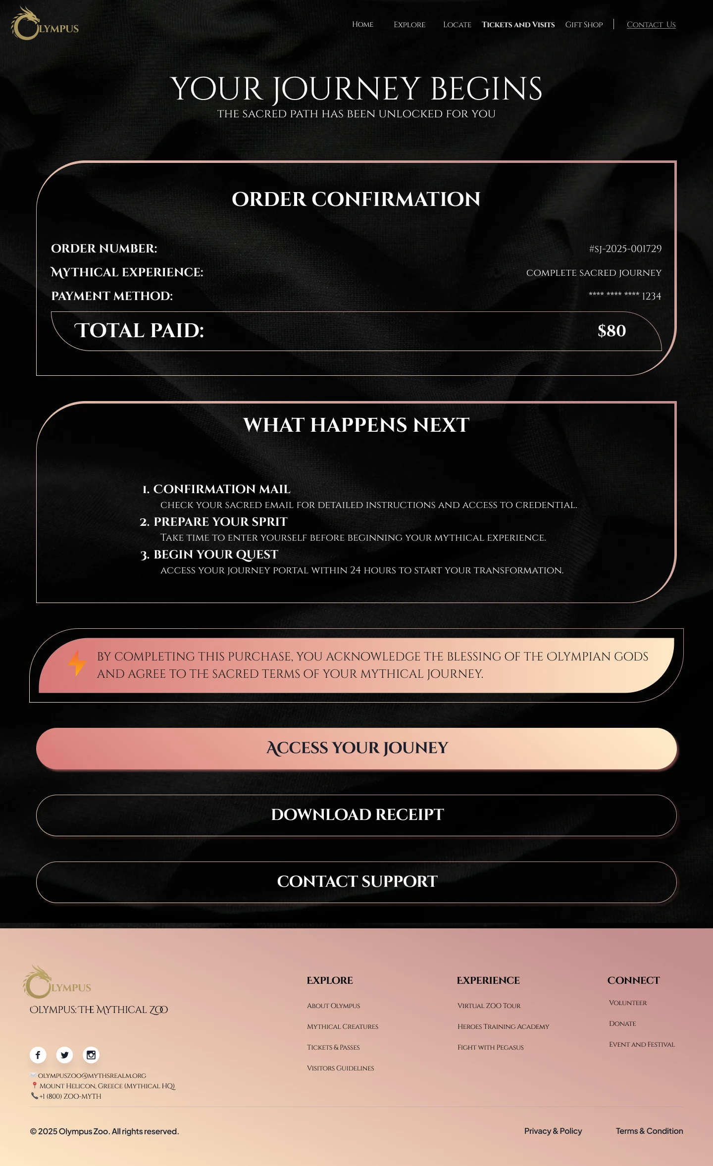
Dark, luxurious textures, soft gradients, and curved cards that echo Greek pottery and temple shapes. Each realm gets its own creature art, safety guidelines, and experience cards. Screens included: home, tickets, each mythical zone, map, gift shop, checkout, and confirmation.
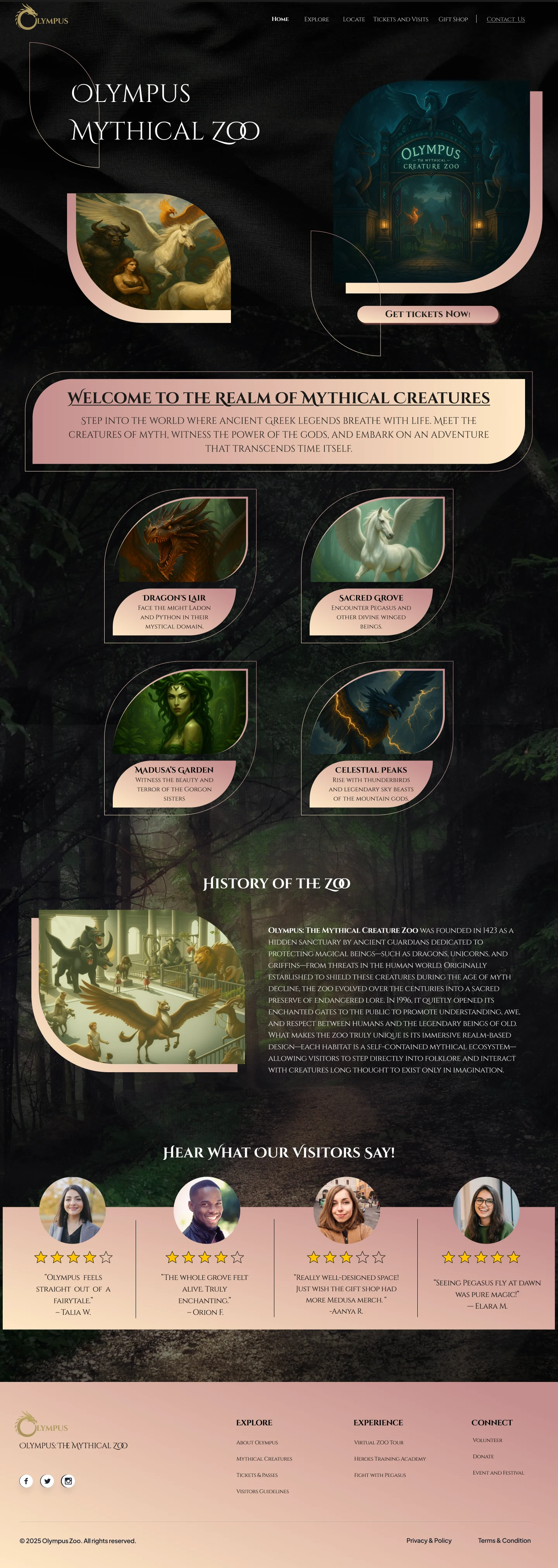
Four mythical zones
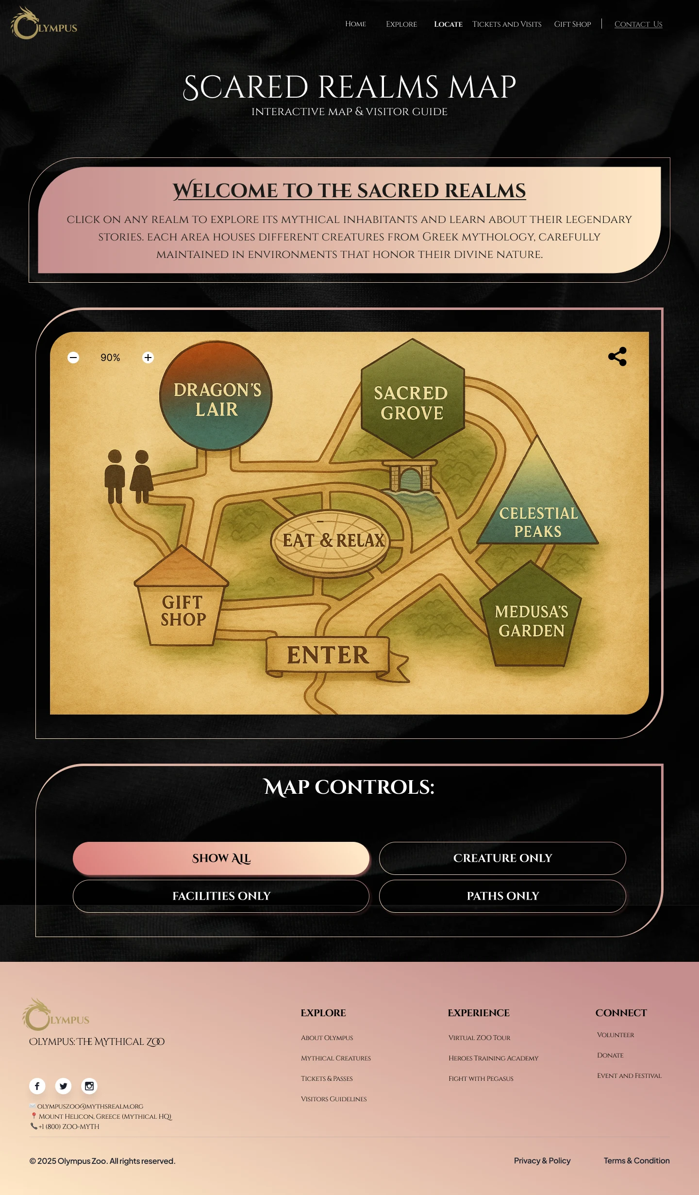
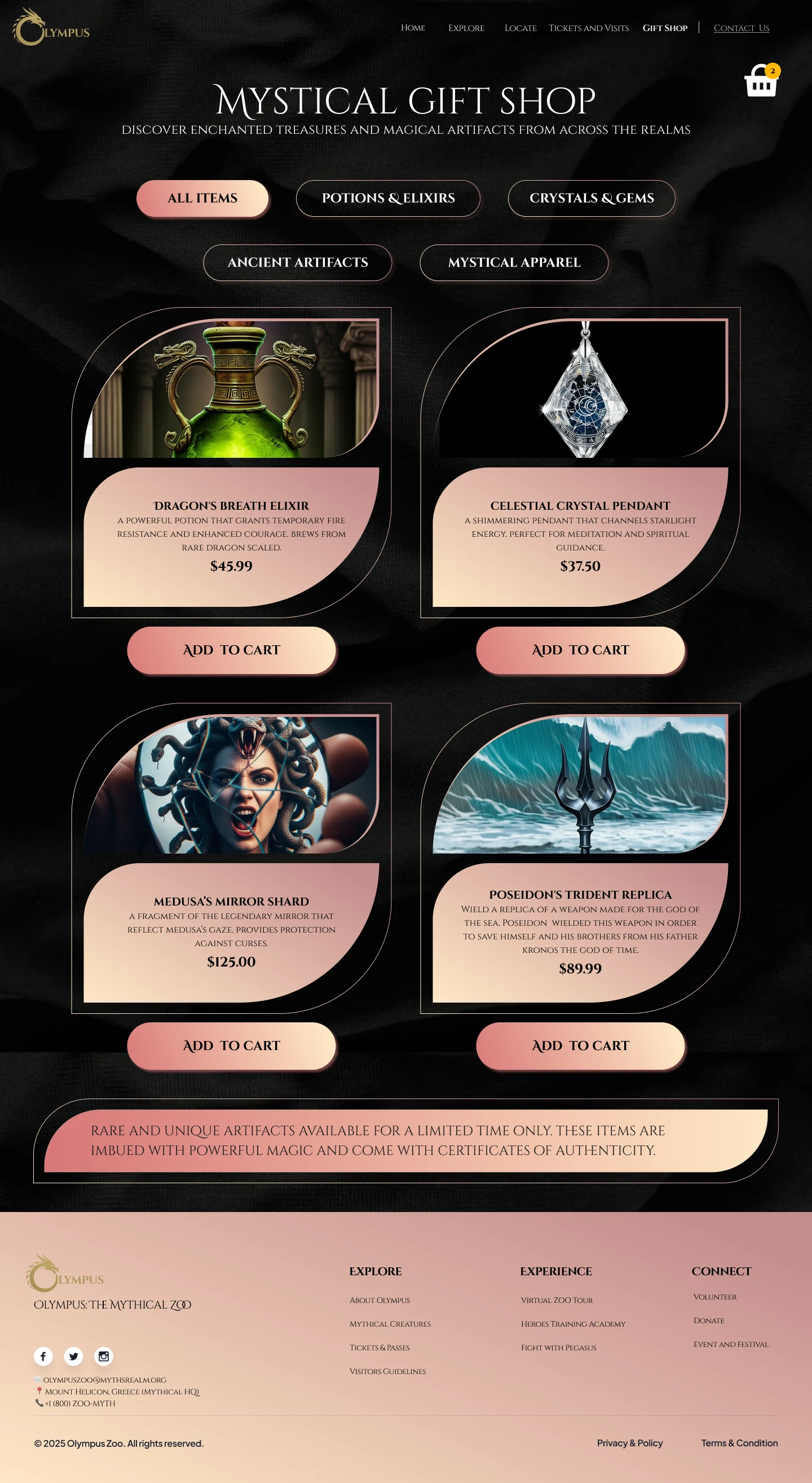
Tickets, checkout, confirmation, map & gift shop
Research, phase 2
High-fidelity prototype usability testing
We built a Figma prototype with 10 interactive screens, covering home, four zones, tickets, checkout, confirmation, map, and gift shop.
- Participants: 2 more grad students (1 male, 1 female), again non-UX.
- Method: 20-30 minute moderated sessions, we described the vision and had them complete key tasks while we observed and probed.
- Buy tickets with a special add-on (e.g., "Flight with Pegasus").
- Explore an exhibit and add an experience to the cart.
- Use the interactive map to plan movement between zones.
- Add an item from the gift shop and check out.
Key findings
Observed- Users loved the world-building ("imaginative and immersive") and zone names, but weren't always sure where to start planning their visit.
- They wanted quick summaries or icons for each zone (time, vibe, type of creatures) to choose faster from the home page.
- A persistent cart summary during ticketing would help them remember what they'd already selected.
- Users asked for a suggested route or itinerary ("How many zones can I realistically do in a day?").
- The impact of add-on experiences on price only became clear at the final step, they wanted earlier, clearer feedback.
- People also wanted reviews and tips ("What's the most popular exhibit?", "Is Medusa peaceful or scary?") to make more confident choices.
Because of timeline limits, we didn't implement these changes in the prototype. Instead, we documented them as future considerations for the next iteration.
What makes it work
Interaction model
Click a card below to see each principle.
-
Myth-themed passes + add-ons
Ticket tiers (Mortal, Young Hero, Elder Wisdom, Divine Family) and special add-on experiences like "Flight with Pegasus" are chosen together, before checkout.
-
Map first, then move
The interactive map lays out every zone, path, and facility so visitors can orient themselves before or during their visit.
-
Story-rich exhibits by realm
Each zone groups its creatures, ceremonies, and safety guidelines together, so exploring feels like moving through a real exhibit, not a list.
-
Gift shop that fits the story
Souvenirs like the Dragon's Breath Elixir and Poseidon's Trident Replica keep the mythology going right through to checkout.
What we delivered
-
Delivered
A 10-screen Figma prototype that supports ticketing, exploration, navigation, and shopping, a clearly defined task flow set (4 core tasks) that we could test end-to-end, a responsive visual language that balances readability with rich, mythic aesthetics, and a prioritized list of next-step improvements based on user feedback (cart summary, route suggestions, zone overviews, reviews).
What I learned
Tested- Narrative can't replace orientation. My psych background helped me see how uncertainty and decision fatigue show up here: users loved the story, but still needed simple cues about where to start and how long things take. World-building has to sit on top of clear wayfinding, not instead of it.
- Non-designers catch different problems. Testing with grad students outside UX showed us issues we'd normalized, like missing date selection and hidden price changes. Fresh eyes are critical, especially when the team is in love with the theme.
- Nudges must respect autonomy, not just behavior change. With passes, add-ons, zones, and souvenirs all in play, people needed running summaries and previews to feel in control. This reinforced my interest in designing cognitive offloading into interfaces, helping users remember, compare, and decide without holding everything in working memory.
- Add a "Recommended route" or sample itinerary to help visitors understand how much they can realistically see in a day.
- Introduce zone summaries and icons (time estimate, intensity, creatures) on the home page for faster decision-making.
- Implement a persistent cart summary visible throughout ticket and add-on selection.
- Make pricing feedback more transparent, especially as add-ons are toggled.
- Add visitor reviews and highlights (e.g., "Most magical for kids," "Best night experience") and continue improving accessibility and deeper exhibit interactions.