Solo Project · SmartKit
Cooking doesn't leave your hands free. The interface couldn't ask for them.
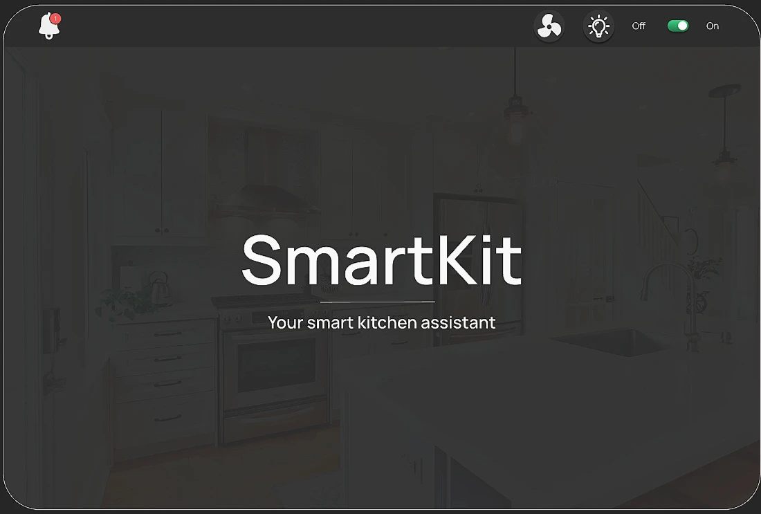
SmartKit is a voice-first cooking assistant that runs on a kitchen exhaust-hood display, keeping cooks focused and safe. I mapped key tasks, prototyped in Figma, and refined the flows through sketch critiques: natural voice prompts, a live transcript and mic feedback, timers, grocery add-to-list, and simple appliance controls.
- Role
- UX Research & Product Design
- Timeline
- 2 weeks
- Contribution
- Research, interaction design, prototyping
The challenge
"Cooks work with messy, occupied hands. Recipe apps expect the opposite."
Cooks often work with messy or occupied hands, moving between heat, knives, and ingredients. Traditional recipe apps expect tapping and reading long paragraphs. That causes lost place, timer juggling, and unsafe glances at phones.
- Distance & environment: 1–2m viewing distance, in a dim, steamy kitchen.
- Attention: short windows, eyes mostly on food and heat.
- Recovery: must support picking back up quickly after an interruption.
-
Inferred
People don't need more information while cooking, they need just-in-time cues they can confirm at a glance. That led to a system where voice does the talking and the UI makes the state obvious.
My first idea was a simple touch screen hung on the wall. Then I came across computerized exhaust hoods while browsing online, and that stuck with me: a screen built into the chimney/exhaust area sits at eye level, right in the center of the cooking activity, and couples naturally with the appliances it's already controlling.
- In scope: UI feedback (transcripts, mic pulsing), projection interactivity, task control via speech, core voice flows (instructions, assistant responses).
- Out of scope: gesture-based input, real hardware response (the oven actually heating up), real voice recognition or NLP.
What the system had to do
- Make the next step obvious at a glance, using voice plus concise visuals.
- Stay hands-free whenever possible: voice prompts, transcript, large controls.
- Always show critical status, timers, temperature, fan/light, safety.
- Reduce "what now?" pauses and hunting through menus.
- Be forgiving: save progress, allow corrections, no dead ends.
"I started by looking at what already exists."
-
Observed
Landscape scan: reviewed 20+ smart-kitchen products already on the market to mood-board glanceable patterns and ambient feedback, and to see where voice interaction typically breaks down, usually in recovering from a misheard command, not in the happy path.
-
Tested
Sketching & critique: sketched two distinct layout directions, then showed them to three or four friends and carried forward the version most people responded to, refining labels and control placements from there.
-
Observed
Moments that matter: mapped mixing, heating, plating, and clean-up to find opportunities for micro-prompts and non-verbal cues, timers, status lights, gentle nudges.
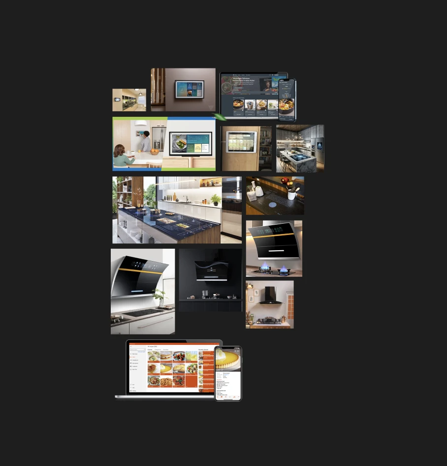
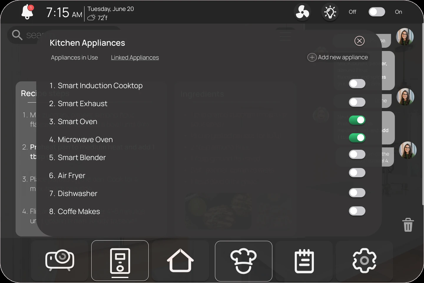
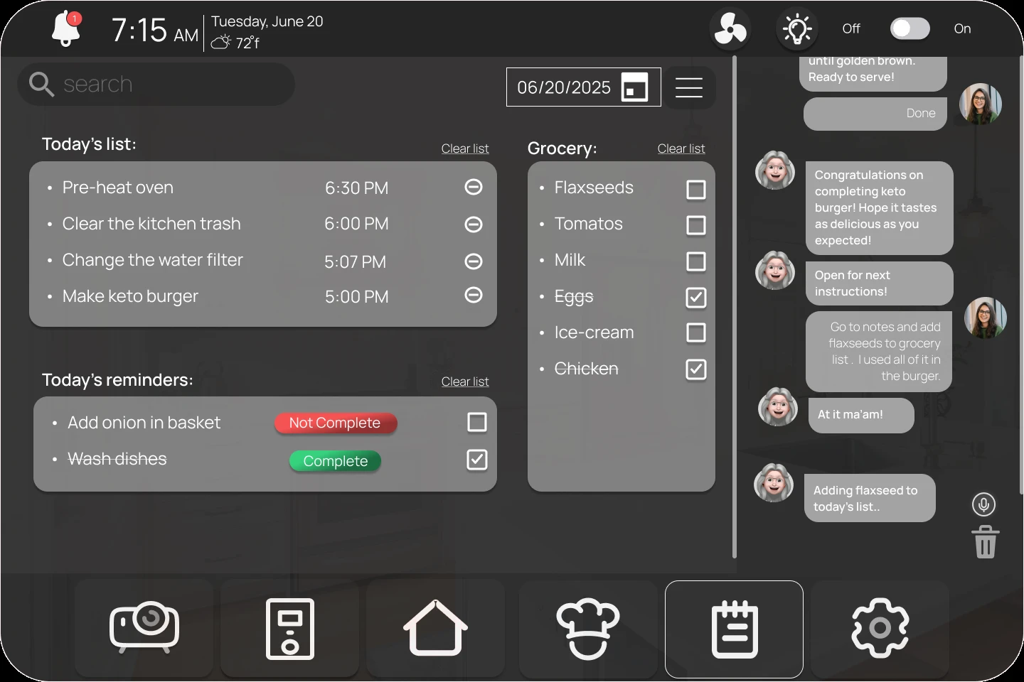
From there I mapped the key tasks a cook actually needs mid-recipe: hearing the next step, restarting a timer, adding a missed ingredient to a grocery list, adjusting an appliance, all without touching a screen with wet or messy hands.
"A dual-channel guide, not another screen to read."
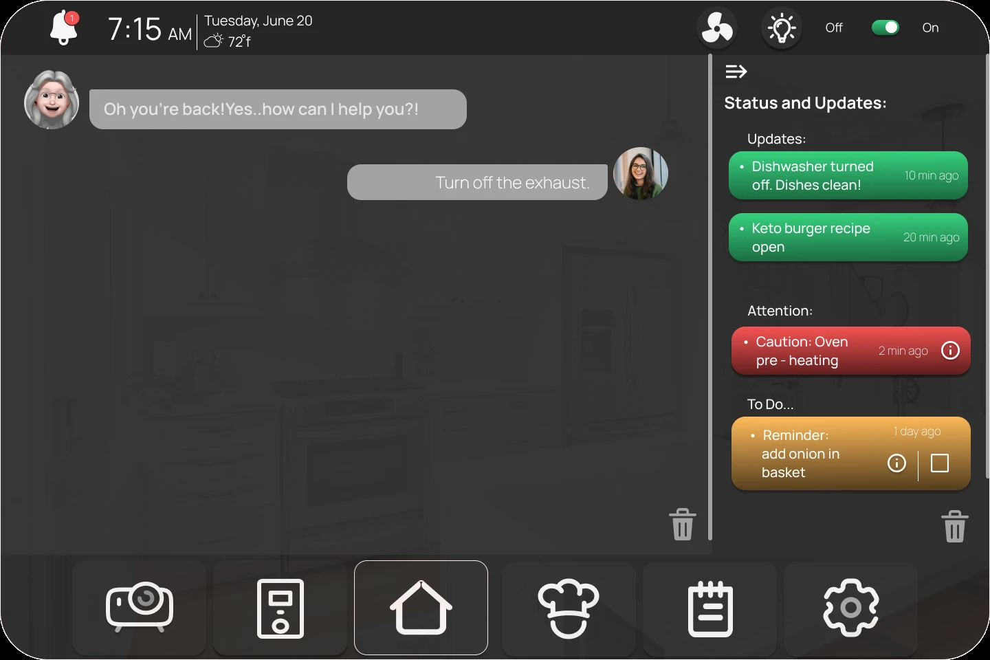
The system speaks the next step while a transcript strip echoes it on screen. A fixed action bar anchors timing, heat/fan, and "next" so controls never move. Ambient rings show progress and safety without interrupting.
- Voice-first, not voice-only: every prompt appears in a transcript panel so users can confirm at a glance.
- Ambient status: subtle edge lighting and soft tones for timers and safety, no blocking modals mid-step.
- Error-lite design: forgiving confirmations ("Ready to proceed?"), progress autosaves.
"Don't design how you want your audience to speak, design how they will."
A line from class that reshaped how I wrote every voice prompt, toward natural, user-centered phrasing rather than directives. The Sketching User Experiences workbook was the other big influence, it's what pushed me to sketch the projected steps as their own separate surface rather than folding everything into one screen.
The course covered storyboarding, video, and physical prototyping too, but none fit this brief. Video is great for storytelling, not for testing dynamic interface interaction. Physical prototyping didn't make sense for hardware that doesn't exist yet. Sketching got me through early layout decisions, but once I needed to show precise dialogue progression and system feedback, only a high-fidelity, clickable Figma prototype could carry it.
What makes it work
Interaction model
Click a card below to see how each principle plays out.
-
Designed
Voice-first with a mirrored transcript so users can confirm silently, plus checkpoints ("Ready to proceed?") and autosave resume to recover after interruptions.
-
Designed
A permanent action bar (timers, heat/fan, settings) with subtle edge-glow and tone for timers and safety.
-
Designed
Ingredient micro-swaps (e.g., flax egg) with quick confirm/undo, plus timely safety reminders.
Prototyped in Figma
Key moments
Optimized for the hood display, with a tablet fallback.
Visual identity
Dark, calm, and legible through steam.
A near-black surface so the display disappears into the hood at rest, with color reserved for status: green when something's handled, amber for a reminder, red for caution. One clean sans-serif, bold for the moment that matters, regular for everything supporting it.
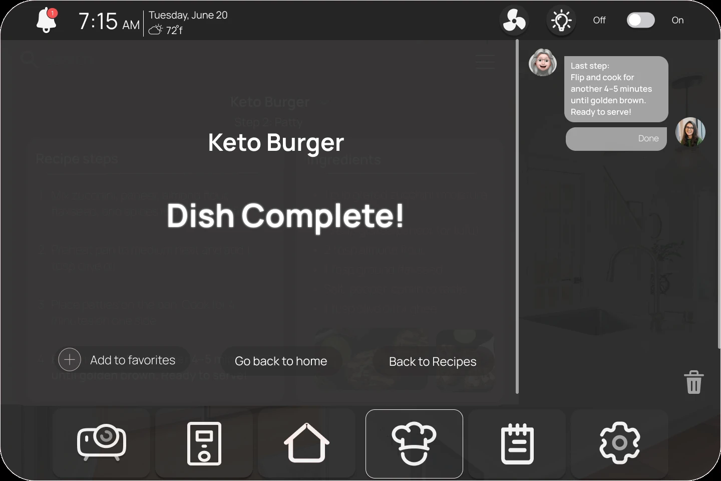
Dish Complete!
Display & confirmationsBold sans-serif, reserved for the moments that close a loop.
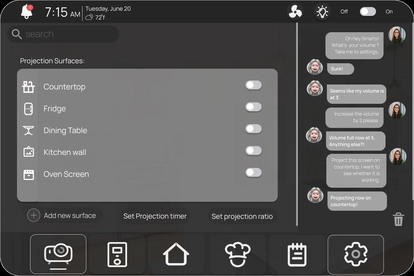
Kitchen Appliances
Labels & bodySame family, regular weight, for everything a cook scans rather than reads.
What I learned
Tested- Design for real, messy life. My psych brain kept screaming: context matters. In a hot, splashy kitchen, short plain prompts and big, stable controls beat clever UI. When hands are busy, reducing cognitive load is kinder than adding features.
- Two ways to feel sure. People trust their actions when they get redundant feedback. Voice plus on-screen transcript gave quiet reassurance ("it heard me") and cut backtracking, a tiny dose of certainty at the exact moment you need it.
- Nudge, don't interrupt. Soft, ambient cues (timer rings, subtle tones) plus a fixed action bar kept flow intact way better than pop-ups. Consistency became the safety net, same place, same actions, less thinking while the stove is on.
On prototyping itself
Three things I'll remember about prototyping
- It's nonjudgmental. Early sketches and low-fi drafts let me try big ideas without worrying about being "wrong." I've come to see prototyping as a space for experimentation, not validation.
- It's a communication instrument, not just a demo. A prototype has to clearly convey its objective, it doesn't need to work exactly like the finished product. Everything I built was meant to communicate the experience, not simulate the engineering.
- Flaws are inevitable, and that's fine. Every test and peer review surfaced something new. I learned not to cling to any one version, even late-stage changes, like how the assistant confirms a request, made the whole thing more robust.
"I prototyped the interaction model, then tried to break it."
-
Proposed
Testing the error-recovery flow in real cooking sessions, hands genuinely occupied, kitchen genuinely noisy, rather than a desk walkthrough, which can't fully replicate the conditions the design is meant for.
- Integrate with real hood and cooktop protocols; add haptic pings to supplement audio.
- Ingredient recognition: one-tap grocery add and smart substitutions.
- Structured study (8–12 participants): time-to-advance, error rate, NASA-TLX workload.