Behavioral UX · FocusMode+
The design tested well by feel. The data told a different story.
FocusMode+ is a lightweight, opt-in layer for YouTube that helps learners stay on-task during a study session, a clear toggle, "Focus-approved" video badges, and a persuasive exit dialog so leaving is a considered choice, not a reflex. We built an interactive prototype in Figma and ran an unmoderated Maze A/B test to see if it actually changed behavior.
- Role
- UX Research & Design
- Timeline
- 3 months
- Contribution
- Research, prototyping, A/B test design
Where it started
"How might we help learners stay focused, without policing them?"
YouTube is great for learning but easy to drift on. Our course project asked: how might we help learners stay focused on a single video session without policing them or breaking the YouTube mental model? I worked on this as a four-person team with Utkarsha Nagtode, Sanjith Kumar, and Priyanka Choudhary, across three phases: building and testing the prototype, then a retrospective that shaped two new proposed experiments.
- Reduce distraction: lower "off-topic" thumbnail clicks and premature exits.
- Clarify intent: make it obvious what Focus Mode is and when it's on.
- Keep control: keep necessary actions visible without clutter.
Concept in one breath
FocusMode+, a lightweight, opt-in layer that you toggle on, which cleans the UI, highlights "Focus-approved" elements, shows a brief onboarding nudge, and adds a gentle, persuasive exit dialog so leaving is a considered choice, not a reflex.
"We set our success metrics before we designed anything."
-
Observed
Problem framing came from listing our own distraction moments plus peer reports: the impulse to scroll, an irresistible side-rail, vague task cues going in.
-
Designed
We defined success metrics up front, before any screens existed: completion rate up, "off-topic" click-through down, early exits down, and a basic comprehension check ("What does Focus Mode do?").
Prototyping for A/B testing
Two prototypes, one deliberately minimal
We built two Figma prototypes to test the concept cleanly against a baseline.
- A. Control case: an exact replica of YouTube, unchanged.
- B. Target case: the same interface with three additions, a Focus toggle, in-focus labeling, and an exit check.
- Focus toggle only: a simple Focus Mode switch added to the YouTube UI, nothing else changed.
- In-focus labeling: while in Focus Mode, the target video (and videos expected to be watched) carried a small "Focus mode" badge.
- Exit check: clicking out to a video that wasn't marked, or out of Focus Mode itself, surfaced a single confirmation dialog nudging the person to reconsider.
We wanted a tight, testable baseline to measure three things in Maze, completion, off-topic clicks, and early exits, without extra copy or visuals influencing behavior. Keeping the UI minimal also let us see where confusion naturally occurred: onboarding understanding, visual distinctiveness, and exit behavior.
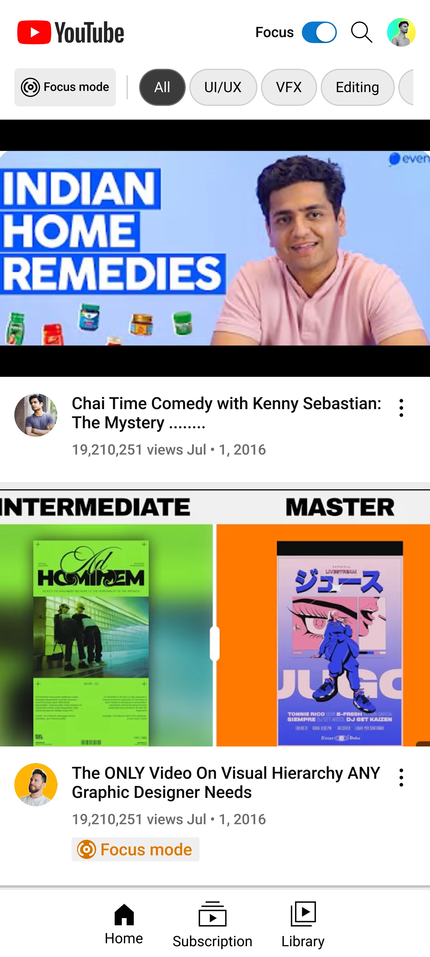

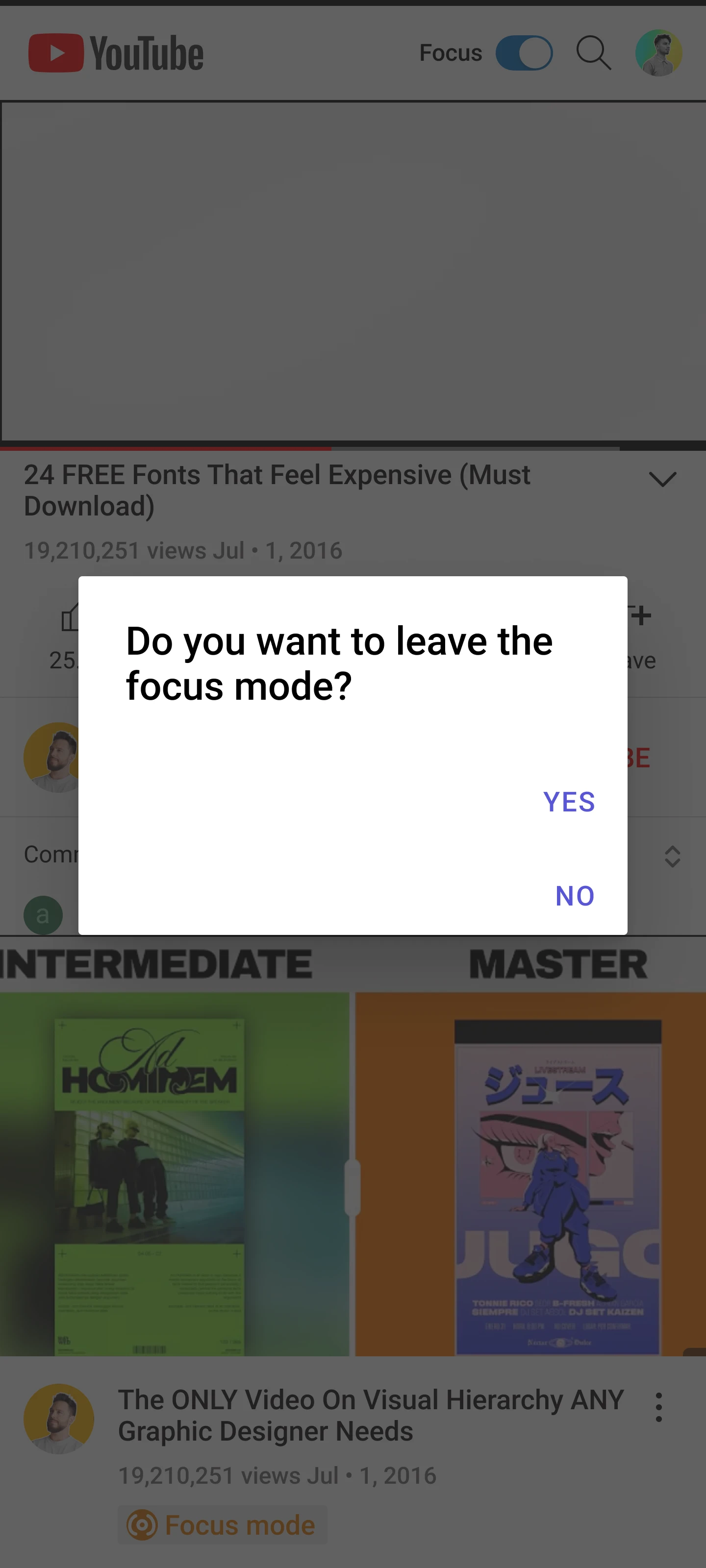
How it works
Interaction model
Click a card below to see each stage of the flow.
-
Designed
A simple Focus Mode toggle added directly to the YouTube UI, no separate app or extension, no setup flow.
-
Designed
A small "Focus mode" badge marks the target video and related videos the person was expected to watch, so the on-task path stays visible.
-
Designed
Clicking an unmarked video or leaving Focus Mode entirely surfaces a single confirmation dialog, nudging a considered choice instead of a reflexive click.
A/B testing
Maze setup
Flow tested: browse → enable Focus → watch → encounter distractions → decide to stay or exit.
Captured: completion, "off-topic" clicks, exit rate and decision time, plus a one-question understanding check.
Our hypothesis: users interacting with the FocusMode+ variant would complete 30% more goal-oriented watch sessions and show 40% fewer off-topic clicks than those on the standard YouTube interface.
- Targeted: 20–30 students and professionals who regularly consume YouTube tutorials and educational content, recruited through in-class participation and peer circles.
- Recorded: ages 25–34, mixed genders, frequent users (most several times a day), watching tutorial/educational, entertainment/vlog, and music content, a good match for the "learning on YouTube but getting sidetracked" problem.
"Imagine you've opened YouTube to watch something useful. Scroll through the home screen and click on a video that grabs your attention. Watch it like you normally would, no pressure, just explore freely."
Bookended by a pre-task survey (usage and platform familiarity) and a post-task survey (experience interacting with the prototype).
What the Maze A/B test told us
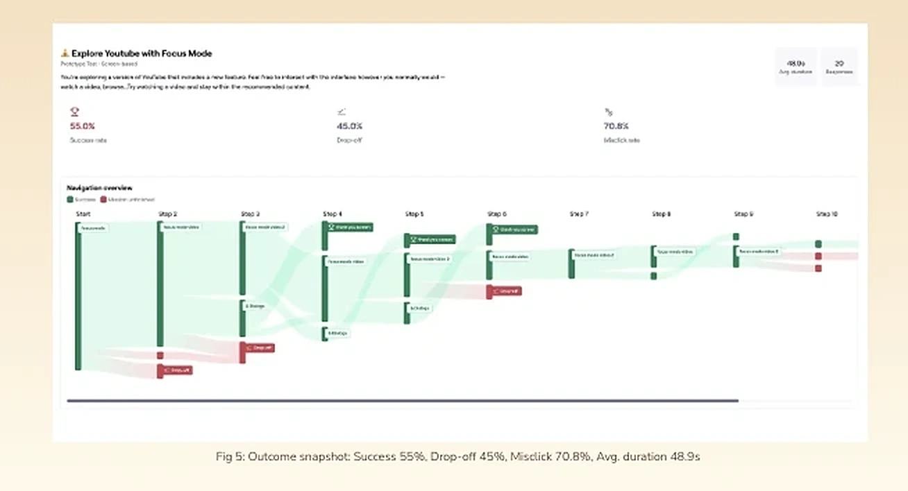
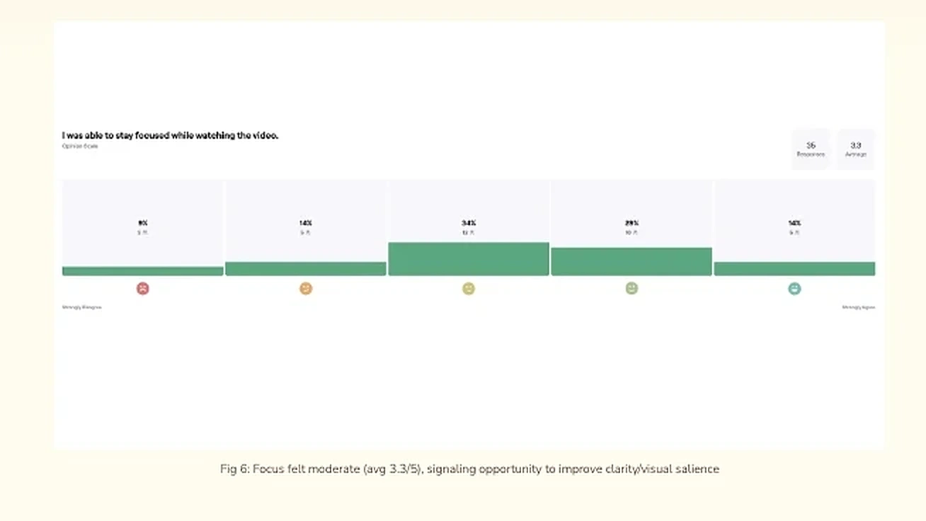
-
Inferred
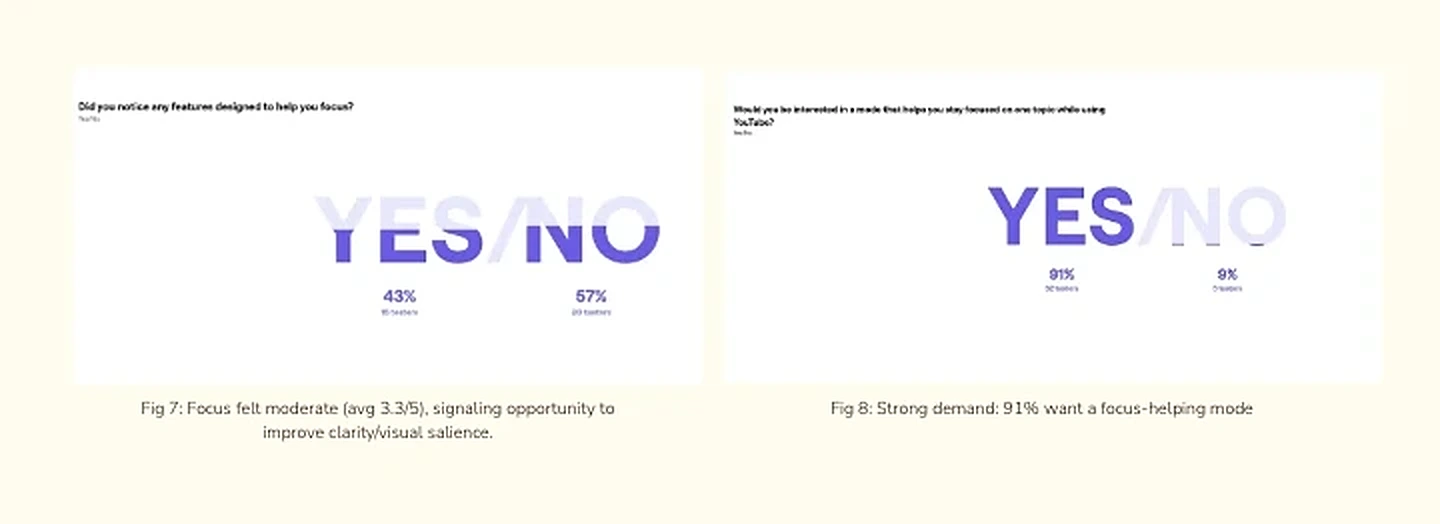
Interest exists, clarity doesn't, yet. Concept was strong, distinctiveness was weak, most wanted the feature, few could find it.
-
Observed
Behavior signals confusion. Success hovering around 55%, with a high misclick rate, points to unclear affordances and underpowered visual cues, not a bad idea.
-
Observed
Relevance is fine, temptation is strong. 63% felt suggested videos were relevant, and the side-rail remains a powerful distraction unless Focus Mode actively counteracts it.
What we heard
- Helpful: the Focus badge made "which video to pick next" clearer for some, having the toggle visible felt empowering.
- Missing or unclear: several people didn't notice the mode, kept toggling without feedback, or expected the side rails to shrink or hide.
- Requested: a bigger player area, de-emphasized related videos, and variants like a "Today Mode" showing only freshly uploaded content.
"The orange 'focus mode' indicator on certain videos showed me which ones were related to the topic I was watching, which helped me pick the next video."
"Yes, focus mode option helped a lot, also it was allowing me to go outside the focus mode as well."
"Similar to Focus Mode, there could be a 'Today Mode' where only videos uploaded today are shown by default."
Phase 3, based on the Maze results
Two experiments we'd run next
Once the numbers were in, we ran a team retrospective before designing anything new.
Observed- Instructions were too vague, people never learned the video was meant to be educational, which made "off-topic" hard to even define.
- Focus Mode started already turned on, so some people never registered it existed at all, and without a plain YouTube baseline to compare against, our conclusions stayed weak.
- The design wasn't visually distinct enough, which is a large part of why 71% of people exited it during the task.
That critique is what shaped both experiments below, letting people turn the toggle on themselves instead of starting it silently, and replacing a flat warning with something more persuasive at the exact moment someone's about to leave.
-
Proposed
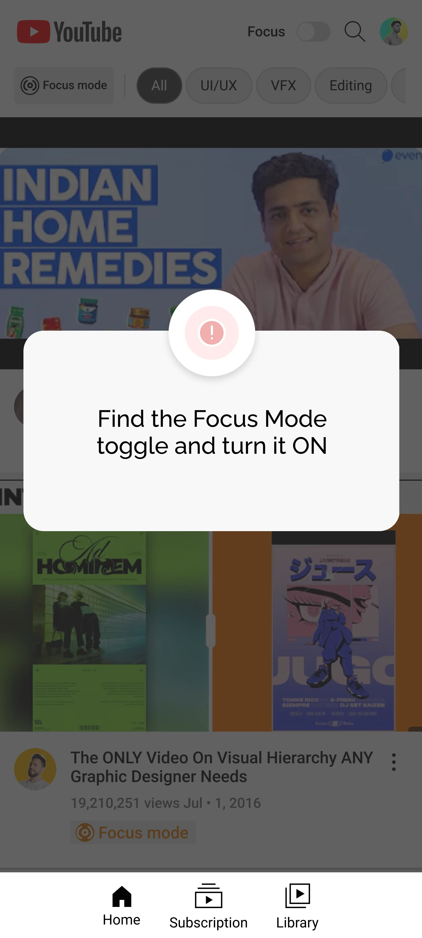
Hypothesis: a quick "what this does" message shown when Focus Mode is first engaged increases comprehension and cuts off-topic clicks by at least 25%, versus the baseline where Focus turns on silently. In the new version, people are told to find and switch the toggle on themselves, so they can't miss what it is, and a short message appears explaining what "Focus Approved" means and that they can leave anytime. Success: off-topic CTR drops ≥25%, and at least 75% of people can correctly describe what Focus Mode does afterward.
a) No onboarding 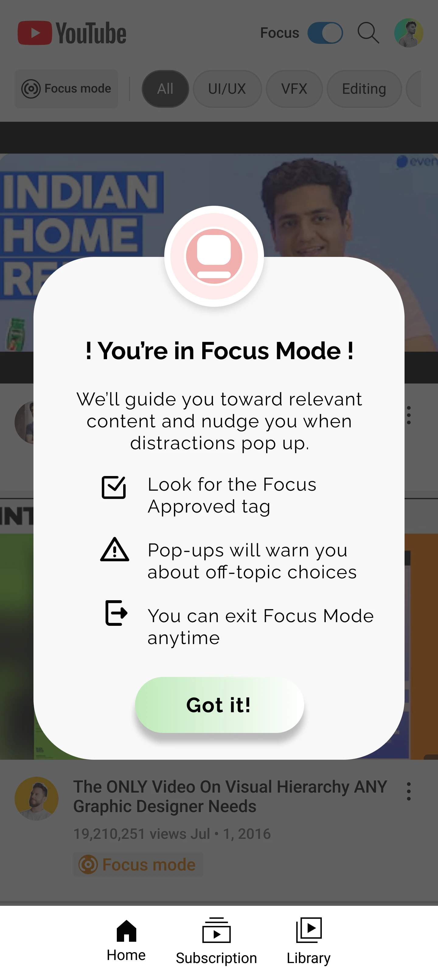
b) Onboarding message -
Proposed
Hypothesis: adding social-proof copy to the exit confirmation ("83% of learners chose to stay and finished") with a clearer Stay action reduces exit rate by 25% compared to a generic "Are you sure?" warning. People weren't leaving because they misunderstood the consequences, Phase 2 showed they knew exactly what they were doing and left anyway. That's a motivation problem, not an information one, which is why the fix leans on social proof rather than another explanation. Ship it if exit confirmations fall ≥25% without harming completion, and if people who stay actually go on to finish more of the content.
a) Plain warning 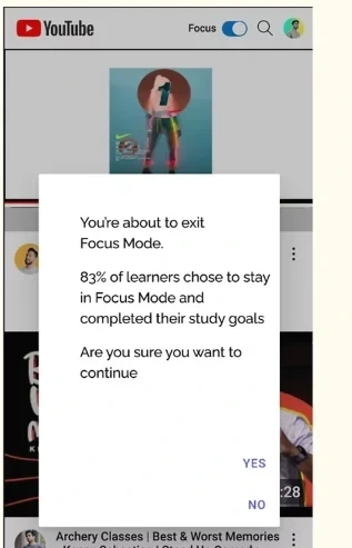
b) Social-proof copy
What I learned
Tested- Clarity plus persuasion. Make the state unmistakable, and nudge at the decision moment. A tiny onboarding burst and clear visual distinctiveness reduce confusion and cognitive load, then, when someone tries to exit, a polite, evidence-based nudge beats a generic warning.
- Design for drift. The side-rail is powerful. Making the "stay with this video" path obvious, badges, reduced visual noise, stable progress cues, helps people commit without feeling restricted.
- Test, don't guess. We set success metrics before design: completion, off-topic CTR, exits. For the follow-up experiments, that means declaring primary metrics, estimating required sample size, running long enough to smooth weekly cycles, and not peeking early to call a winner.
- Run both A/Bs (onboarding + social-proof exit) with the same tasks and a larger sample, reporting deltas on off-topic CTR, exits, completion, and comprehension.
- Strengthen the distinctiveness of the Focus state: badge, dimmed rails, a progress indicator, subtle header tone.
- Capture secondary signals, time-to-first off-topic click and decision time in the exit dialog.