 Learning Experience Coordinator, UX Co-op
Professional Work · NBME
The information was there. The path to it wasn't clear.
Managers had access to self-service HR resources, but finding the right information wasn't always intuitive. I studied how they searched, redesigned the Managers' Portal around what I found, and tested the new direction with users. This co-op also included three more projects, all further down this page.
- Role
- UX Research & Instructional Design
- Platform
- SharePoint · Genially
- Timeline
- Oct 2025 – Mar 2026
"Managers were using it because they had to, not because it worked for them."
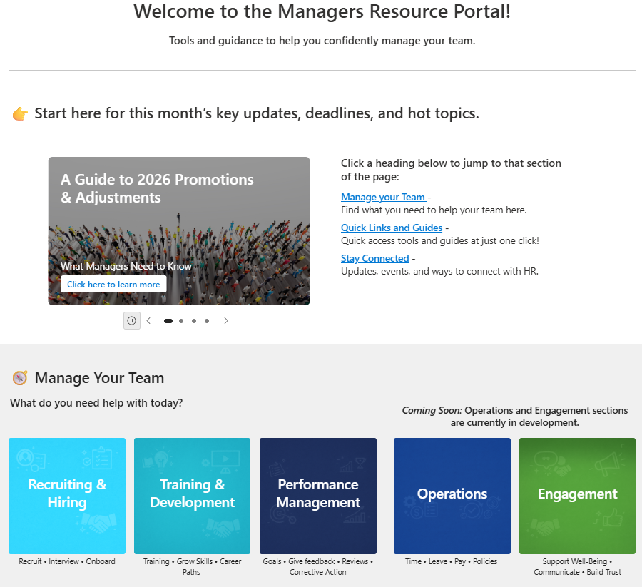
The Managers' Portal is where managers are supposed to go for self-service HR resources instead of emailing HR directly. The portal existed. The content existed. But managers kept reaching out to HR anyway.
- Problem
- Available information wasn't findable.
- Approach
- Mapped the IA, ran a 6-scenario scavenger hunt, then 9 usability walkthroughs.
- Outcome
- Navigation depth dropped from ~5 clicks to ~2–3; 6 fixes shipped.
"I sat with managers while they tried to get their actual work done."
I wanted to see how managers actually searched, not how the site map said they should. That meant a six-scenario, cross-team scavenger hunt: real HR tasks, real managers, watched in the moment they hit friction.
Observed- Across 9 structured usability task walkthroughs, managers frequently abandoned their search path partway through and either guessed at a link or gave up and messaged HR directly.
- The same piece of information was often reachable through more than one inconsistent path, and managers described the labeling as "not the words I'd use" for the task they had in mind.
- One scenario asked a manager to find guidance for approving a specialty chair an employee needed for a disability accommodation. It took a walk through the entire site, both top-level tabs, and finally the written instructions before they made the connection that "ADA" lived under Leave of Absence, not equipment or facilities.
- A resignation scenario went the opposite way: "separation and offboarding" was recognized and found on the very first glance. The gap wasn't a general difficulty with the site, it was specific to how well each topic's real-world name matched its label in SharePoint.
"The friction wasn't really about the interface."
InferredThe recurring breakdowns tracked back to a mismatch between how HR had organized the content internally and how managers actually framed their own questions. Managers weren't failing to use the portal, the taxonomy was answering a different question than the one they were asking.
AVAILABLE ≠ FINDABLE
"I redesigned around how managers actually looked for things."
The research surfaced 9 usability pain points. I prioritized by impact and effort, and carried 6 forward as the fixes that would matter most in a first pass.
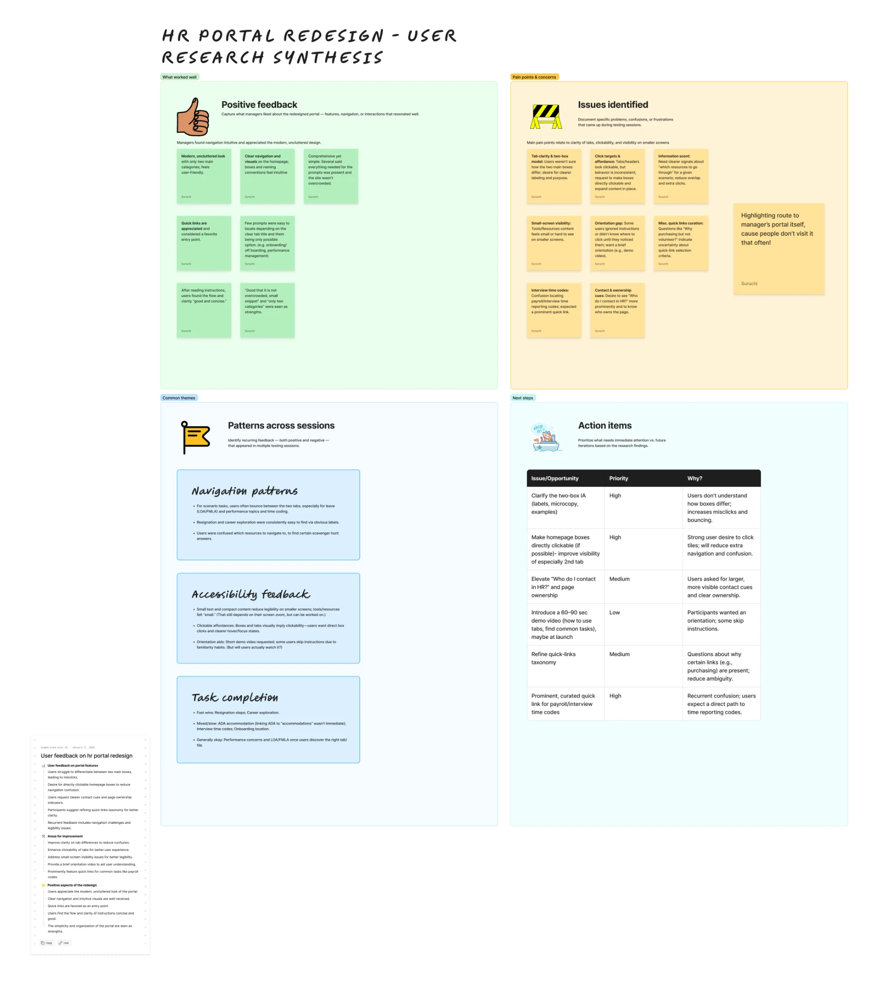
- Restructured the portal's information architecture and taxonomy around the task language managers used in sessions, rather than HR's internal category names.
- Rewrote navigation microcopy and consolidated duplicate paths to the same content, then rebuilt the affected flows in SharePoint and Figma.
"Then I put the new direction back in front of managers."
-
Tested
Ran 6 scenario-based validation sessions against the redesigned IA. Managers reached target resources in noticeably fewer steps, and the navigation depth for common tasks dropped from roughly 5 clicks to 2–3.
-
Proposed
Extend the same taxonomy work to the remaining HR SharePoint sub-sites that weren't in scope for this first pass, so managers get a consistent search language sitewide.
This was the most complete, fully validated piece of research-to-design work from the co-op. Three more projects ran alongside it.
"A learning journey people abandoned after month one."
NBME's New Hire Learning Journey was a Genially course gated to a fixed timeline, and engagement dropped off after month one. I redesigned it around a "Growth Garden" model: the same content, reorganized by skill area instead of by date.
- Problem
- A rigid, date-gated course that people stopped opening after month one.
- Approach
- Reorganized content into 5 skill-based "beds" learners can explore in any order.
- Outcome
- Recognized by my manager as a standout solution; more people return to the material.
The drop-off wasn't about content, it was structure: a fixed timeline assumes everyone needs the same thing in the same week, which isn't true for a mixed group of new hires.
Five skill beds, not five weeks
Every course in the journey now lives under one of five skill areas, each its own "garden bed" a new hire can explore in any order:
Growth stages, not deadlines
A lighter-touch timeline still exists underneath the skill beds, it just doesn't gate access. Click a stage to see what it's for:
-
Designed
Foundational courses for getting oriented, the ones every new hire needs regardless of role.
-
Designed
Deeper courses in each skill bed, once the basics from Early Growth feel comfortable.
-
Designed
Advanced material that strengthens and expands on the skill beds built over the first six months.
-
Designed
A short quiz at the 3-, 6-, and 10-month marks produces a personalized "Growth Report": what's been completed, what's ready to grow next, and a couple of specific course recommendations, so progress doesn't depend on remembering a fixed schedule.
-
Proposed
A dashboard view of the whole garden: progress per skill bed, badges for completed stages, and a "next recommended seed" so there's always an obvious next step without it being the only option.
"Dense legal content, built for people who aren't lawyers."
NBME asked for an eLearning course covering the employment-law basics every manager should know, built from scratch in Genially for a non-specialist audience.
- Problem
- Dense legal content, no course, a non-specialist audience.
- Approach
- Sourced the content myself, wrote learning objectives, built scenario-based interactions.
- Outcome
- A shipped course covering 5 plain-language employment-law topics.
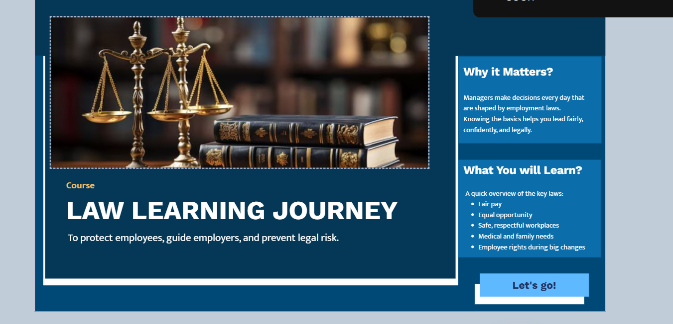
- Framed the course around "why it matters" before "what to memorize": managers make decisions every day that are shaped by employment law.
- Organized the legal content into five plain-language topics: fair pay, equal opportunity, safe and respectful workplaces, medical and family needs, and employee rights during big organizational changes.
- Built the interactions as short scenarios rather than a read-through: a manager works through a realistic situation and sees how the law applies, instead of reading the regulation in the abstract.
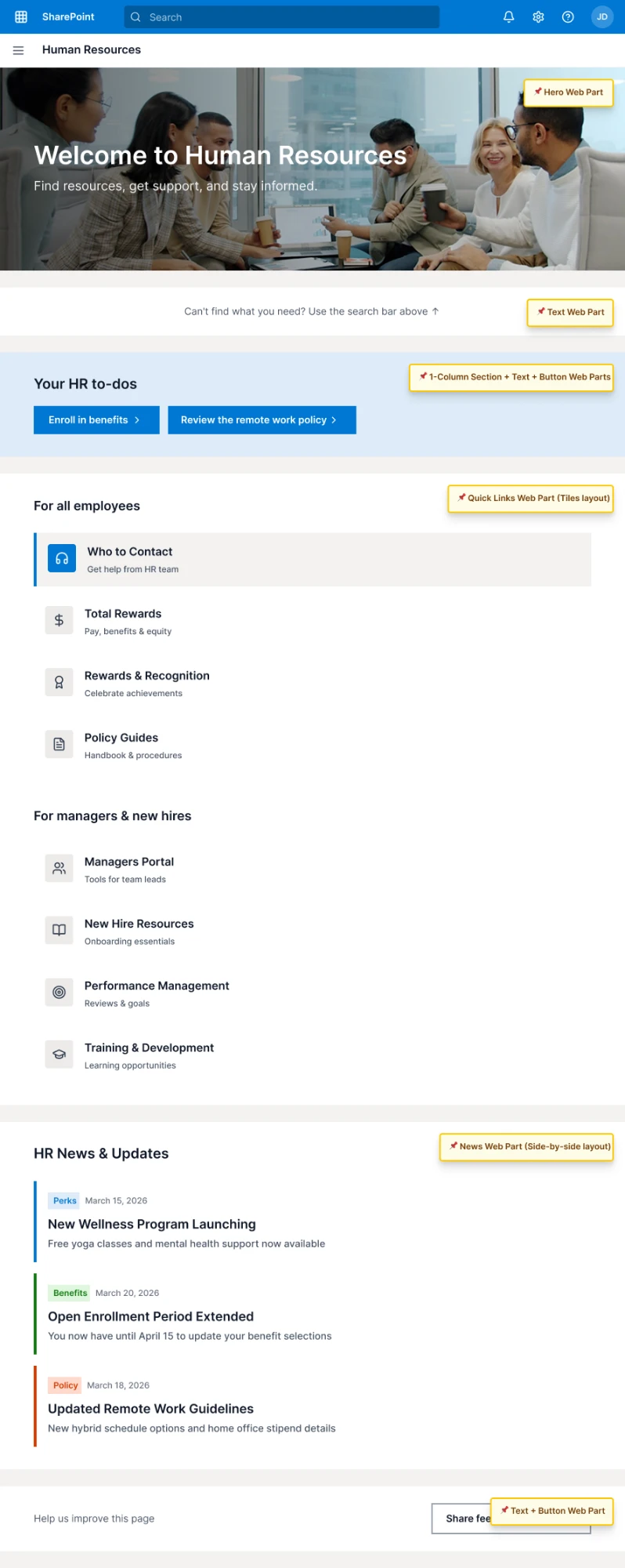
A full redesign of the HR homepage
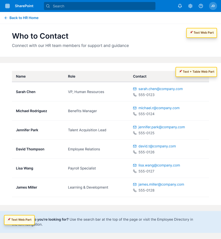
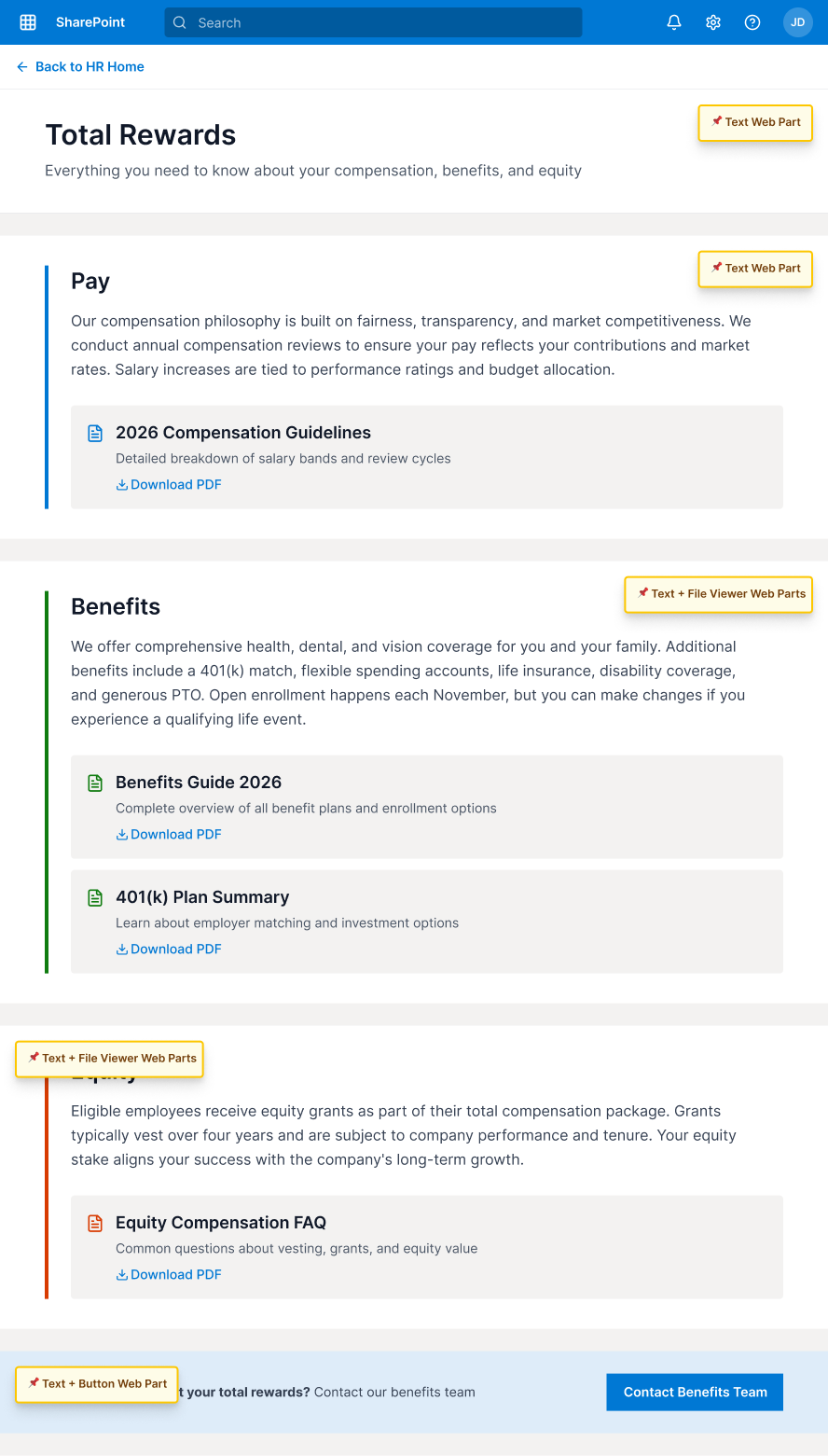
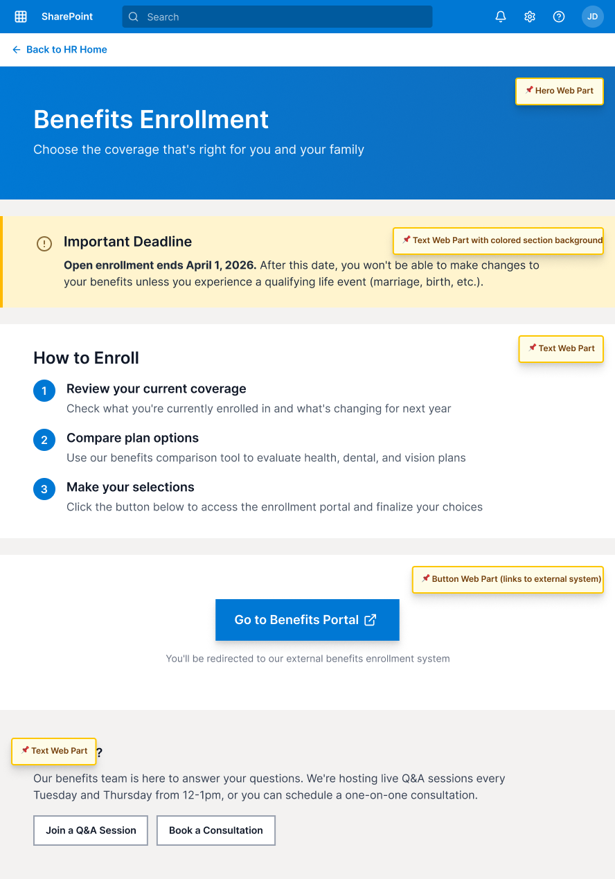
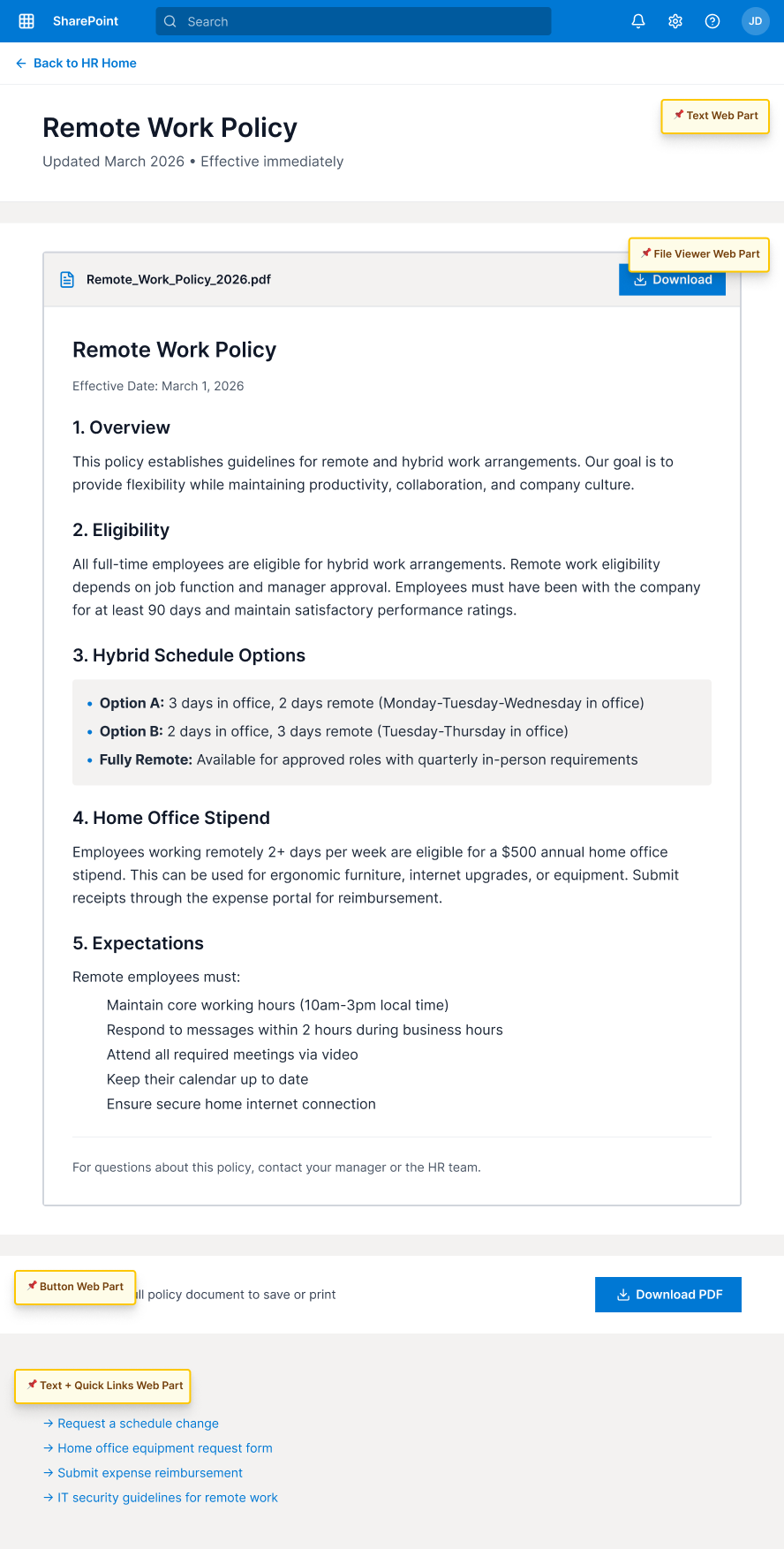
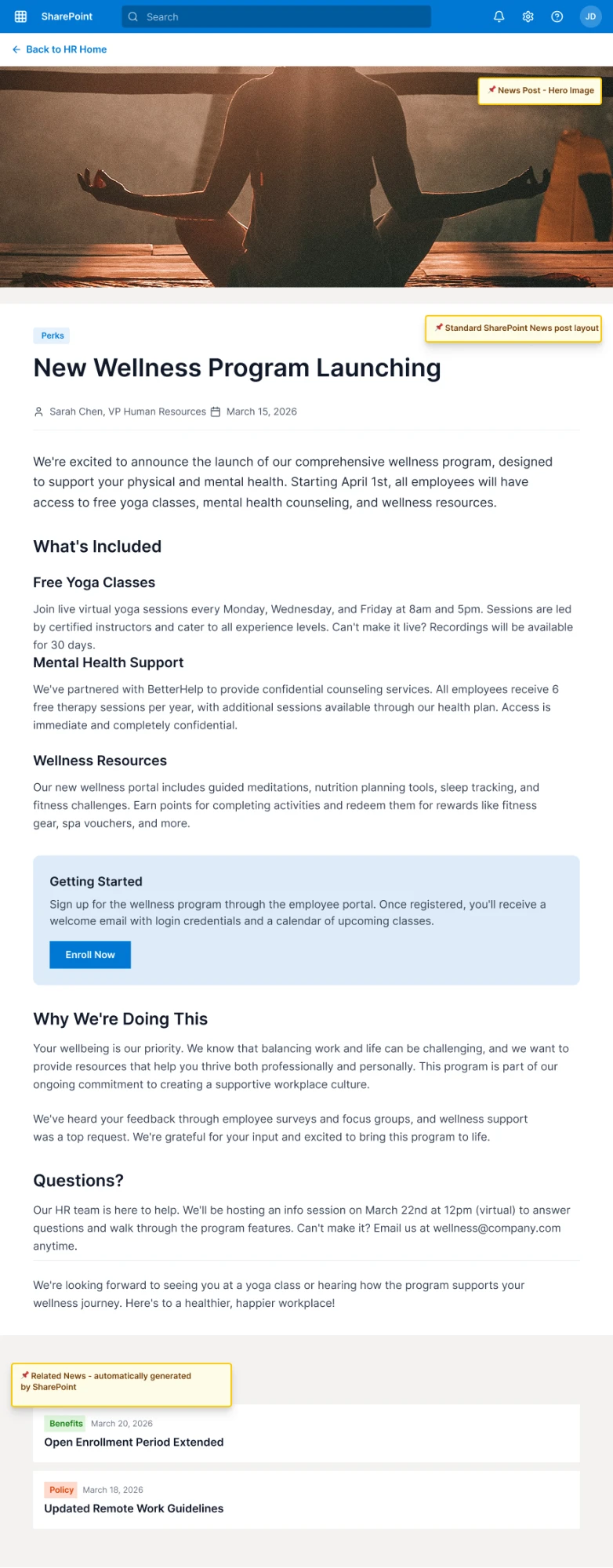
I prepared Figma mockups and a content-strategy deck for the HR landing page and its key sub-pages, grounded in the same navigation data and interview insights as the Managers' Portal work.
- Problem
- The HR homepage needed a refresh grounded in real navigation data.
- Approach
- Figma mockups for the homepage plus 5 linked sub-pages, annotated for handoff.
- Outcome
- A dev-ready screen set covering contacts, rewards, benefits, and policy pages.
Recognition
In their own words
"She is thoughtful, reliable, detail-oriented, and has a remarkable curiosity driven approach. She did a fantastic job collaborating with me on projects such as the Manager Resource Portal, where she helped summarize feedback, identify key themes, redesign the main landing page and communicate insights clearly."
"Suruchi brings a level of creativity, thoughtfulness, and enthusiasm to learning projects that truly stands out. She is especially skilled at designing engaging learning materials and new resources, including our Manager Portal and our New Hire eLearning. She was always open to refining her ideas to ensure clarity and impact for the end learner."
"Suruchi works in a way that is autonomous, collaborative, thoughtful, and results-driven. She made great strides in a short time working on internal eLearning revisions, developing new content, and reviewing and editing internal web pages with an eye toward UX."